
Introduction
Employee disengagement has a real cost: in France, it represents an average of €12,600 per employee per year in the private sector. In partnership with VYV Care, Micropole set out to tackle this problem at its root, by giving employees a tool that makes the company's strategy visible, understandable and genuinely appropriable by everyone. Over two months, I designed Viglow end to end, from user research through to high-fidelity mockups, making sure every design decision served a single goal: giving each employee both the desire and the means to contribute to their organisation's success.
How might we design an internal information tool that makes company strategy and projects visible and appropriable by all employees, in order to reduce disengagement and strengthen the sense of individual contribution?
Focus groups with employees across a range of profiles and more in-depth interviews with Business Unit managers.
User flows, wireframes and high-fidelity mockups aligned with VYV Care’s visual identity.
Problem Definition
Existing internal communication tools share a common flaw: they are built to broadcast information, not to create engagement. Traditional intranets accumulate content without clear hierarchy, internal newsletters go unread, and front-line employees remain structurally disconnected from strategic decisions. The disengagement that follows is not a matter of individual motivation — it is a direct consequence of a lack of visibility and meaning. The challenge for VYV Care was to design something fundamentally different, centred on clarity, autonomy and the collective ownership of strategy.
The research phase combined focus groups with employees across a range of profiles and more in-depth interviews with Business Unit managers. These conversations surfaced three structural issues: the need to increase employees' sense of autonomy, the importance of giving everyone a way to express and share their expertise, and the necessity of making company strategy appropriable at every level of the organisation. These three axes became the guiding principles behind every design decision that followed.
Strategy has to be visible to be understood
Employees cannot engage with projects they cannot see. Making the company's project map accessible to everyone, with a level of detail adapted to each profile, is the primary lever for engagement.
Information hierarchy determines cognitive effort
A tool that requires too much effort to find relevant information is a tool people stop using. The design had to allow each user to quickly reach what concerns them, without being overwhelmed by what does not.
Engagement comes from feeling like a contributor
Knowing that your work is part of a larger initiative changes your relationship to the task. The tool needed to create that connection between a collaborator's daily work and the organisation's strategic vision.
Solution Design
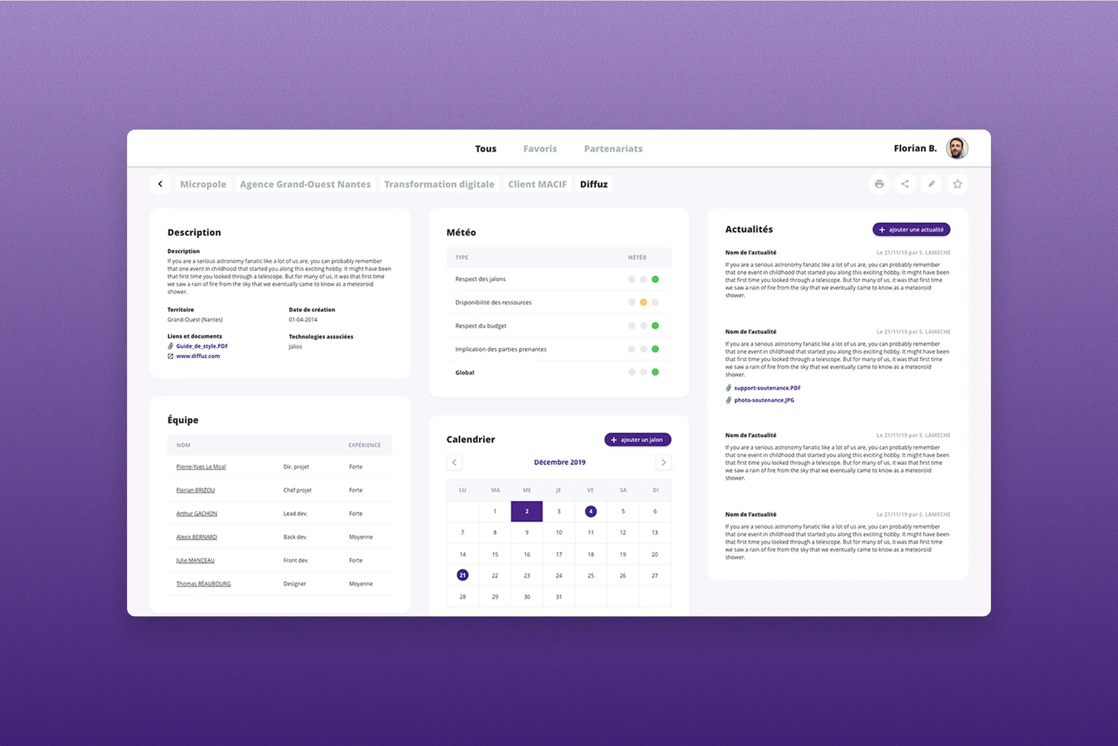
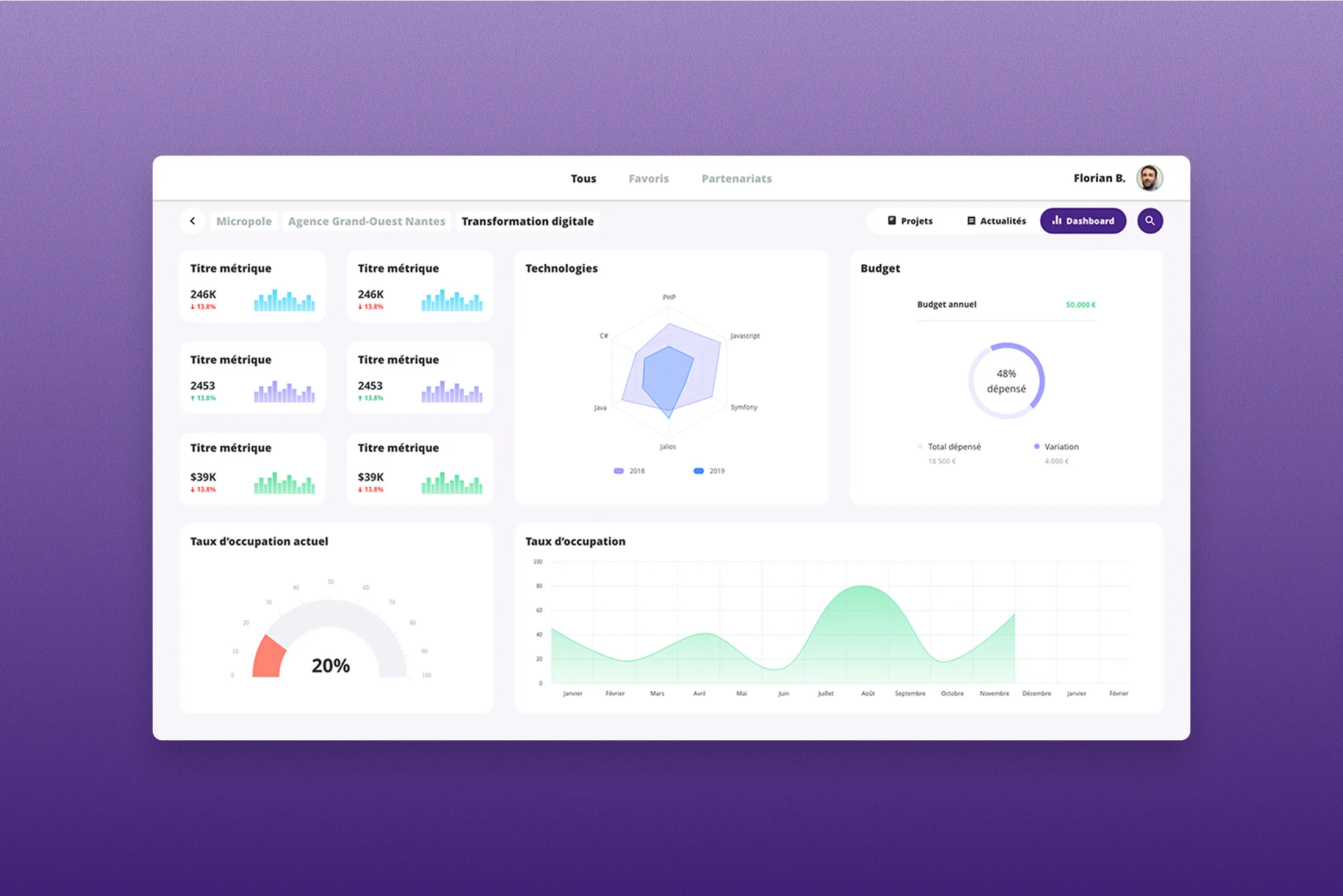
Viglow is an internal information and employee engagement SaaS, designed for three types of users: senior leadership, project leads and all other employees. Each profile accesses a level of reading adapted to their needs, from the high-level statistical view reserved for managers down to the project detail page available to everyone. Features were prioritised around three areas most directly tied to the research insights: navigation clarity, project representation and the notification system.
The low-fidelity mockup phase was central to defining the tool's core concept. After many iterations, representing projects as stacked cards emerged as the clearest and most intuitive solution. A stack of cards represents a group of projects (by agency, theme or status) and gives an immediate read of the overall progress at a glance. This layered navigation structure, from group to project to detail page, organises the entire experience and allows each user to enter the tool at the level that is relevant to them. The favourites system and notifications complete the journey by giving quick access to the projects each user is following closely.
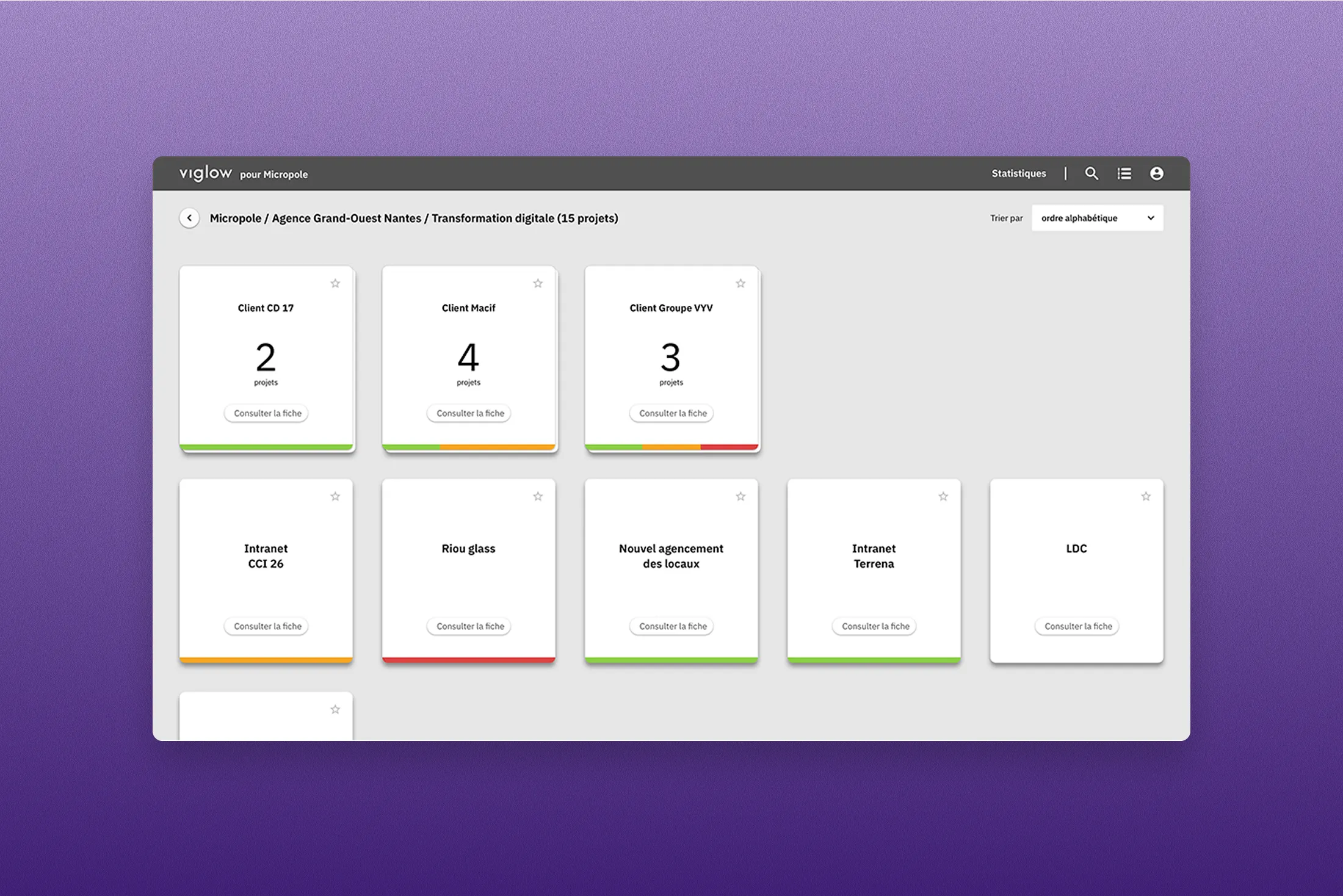
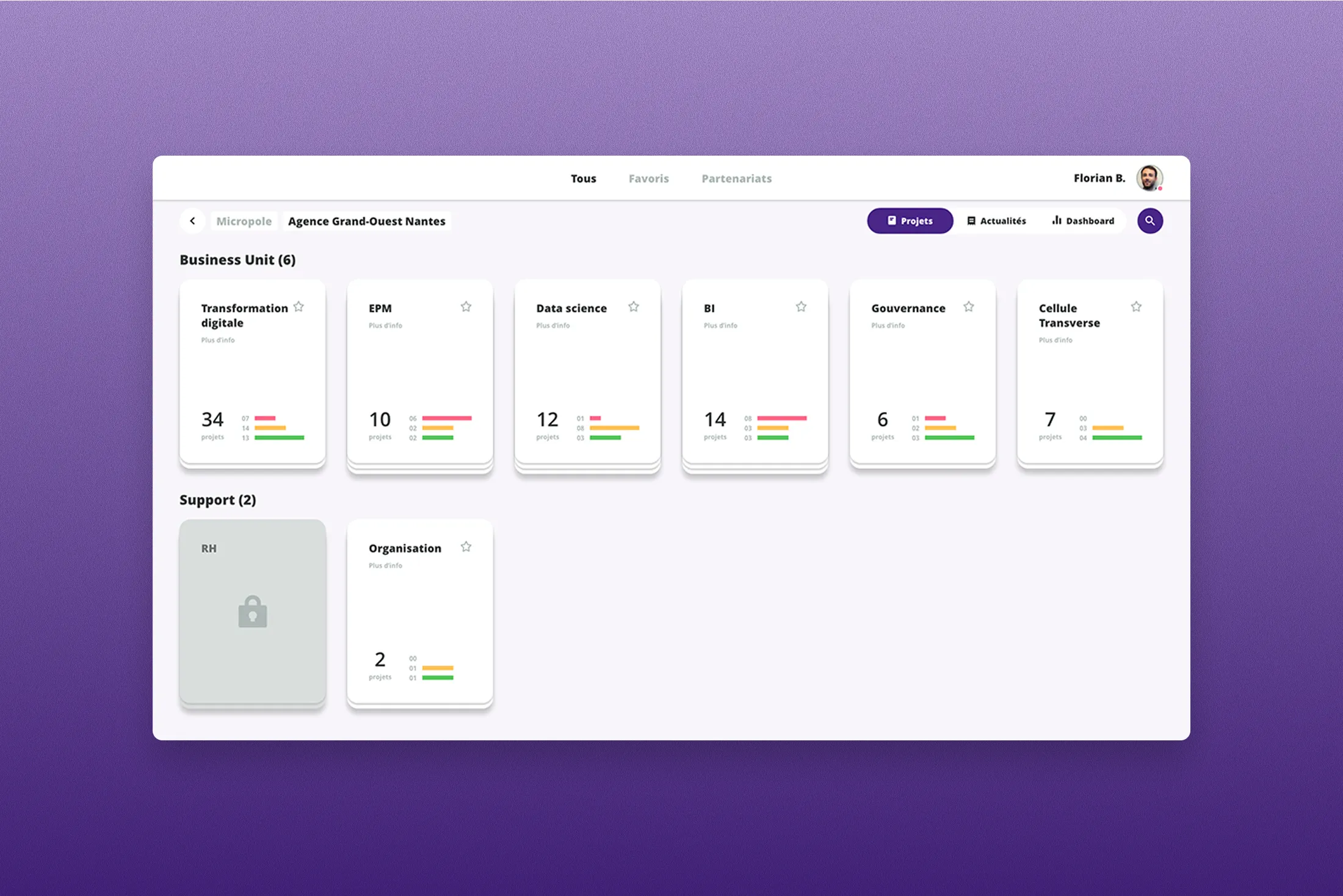
The interface was designed to be simple, low-effort and fully aligned with VYV Care's visual identity. I paid particular attention to component animations, especially the transitions between card states and interactions on project stacks, so that every micro-interaction reinforced legibility rather than adding visual noise. Accessibility constraints were built in from the start rather than added at the end. The statistics view, designed for managers and decision-makers, offers a more synthetic representation of project stacks and complements the main view without duplicating it.
Development was handled by Micropole's internal engineering team. The collaboration relied on high-fidelity mockups detailed enough to limit back-and-forth and maintain the intended level of finish, particularly around animations. The tool was deployed within the Groupe VYV intranet at the end of the mission.
Results & Learnings
Viglow was successfully deployed within the Groupe VYV intranet. Client feedback was strong enough for the concept to travel beyond its original scope: Micropole Grand Ouest adopted the tool internally for its own project communication. That is a rare form of validation, an agency using for itself what it built for its client.
This project gave me the conditions to push design to a level of detail that time constraints do not always allow. Working carefully on component animations, refining every transition and every state, confirmed something I now hold as a principle: execution quality is not a luxury, it is a credibility lever. A well-animated tool is easier to understand, easier to use and generates more trust from its users.
What would I do differently? I would have liked to run a user testing session before deployment to validate the navigation choices in practice, particularly the stacked card metaphor, which felt intuitive to the project team but deserved to be tested against users who had no part in its creation.