
1. Introduction
Smala is a second-hand children's clothing platform built around a single promise: curated, certified quality. Rather than facilitating peer-to-peer transactions, Smala acts as a trusted intermediary, buying directly from sellers, inspecting every item, and reselling it to buyers. With 70,000 items in stock, a 95% sell-through rate, and all unsold inventory donated to charities, the model is as much about values as it is about business. With 85% of traffic already coming from mobile and a clear ambition to become the go-to app for parents, Smala decided to make the move to a native application. Over two successive sprints of roughly ten days each, we first audited the existing experience and interviewed users, then designed the mobile app based on those findings.
How might we design a mobile application that simplifies and streamlines the experience of buying and selling second-hand children's clothing, in order to drive repeat usage and accelerate Smala's business growth?
UX Audit & Research (sprint 1, collaborative)
UX/UI Product Design (sprint 2, lead)
2. Problem Definition
The second-hand children's clothing market is growing fast, driven in part by generalist platforms like Vinted that have normalized resale behavior across a wide audience. Smala's key differentiator is its position as a trusted third party: where Vinted connects individual buyers and sellers, Smala takes ownership of the item, checks its condition, and handles the resale. That quality guarantee is a genuine competitive edge, but it also comes with a strict quality charter and a more structured submission process than anything competitors require. That tension turned out to be exactly where the most significant friction points were concentrated.
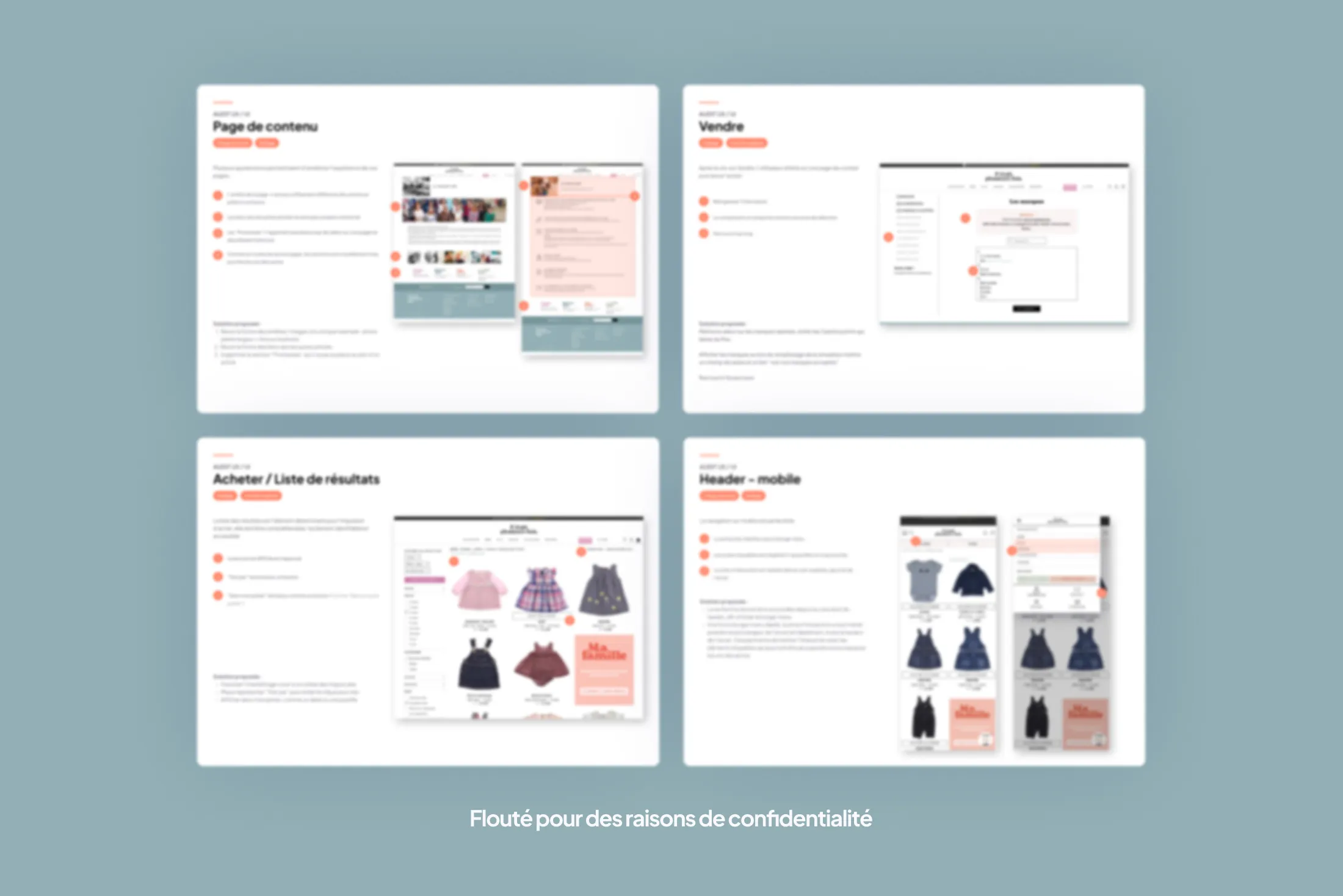
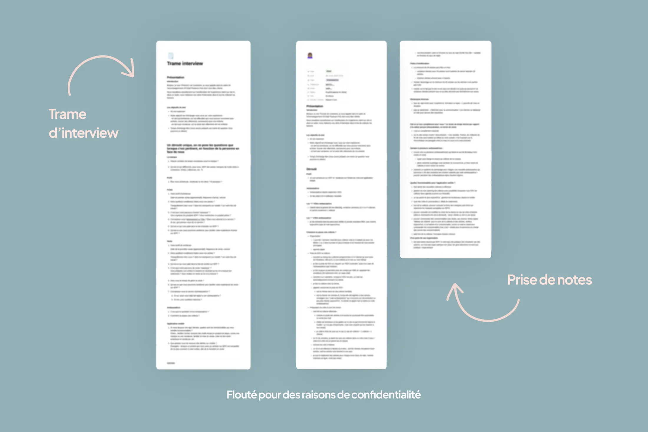
The first sprint combined a full audit of the existing web and mobile experience with eight user interviews conducted with both buyers and sellers, for which I co-wrote the discussion guide and led one of the sessions. Two structural problems emerged clearly. On the seller side, the listing process was consistently described as long and cumbersome, directly slowing the pipeline of incoming inventory. Smala's strict quality charter also generated a rejection rate that sellers perceived as high and unpredictable, creating frustration and discouragement among the most active contributors. On the buyer side, the absence of push notifications and the friction of navigating through a mobile browser were the main barriers to repeat usage, in a context where 85% of traffic was already happening on mobile.
Streamline the seller journey to feed the inventory
With 2,000 items coming in every day and an average product lifespan of 20 days on the platform, stock velocity is critical. Every point of friction in the listing process translates directly into lost volume and missed revenue.
Leverage native mobile capabilities
Push notifications, geolocation, and personalized alerts based on size, category, or purchase history are levers the website simply cannot activate. A native app was the right move to build the habitual usage that a mobile browser can never quite deliver.
Grow MRR through "La Tribu"
Smala's subscription offer, which reduces buying and selling fees and grants early access to exclusive sales, was an underutilized growth lever on the website. The app was an opportunity to give it the visibility it deserved and turn it into a meaningful engagement driver.
3. Solution Design
The second sprint, which I led solo, was focused on porting the essential features of the web experience into a mobile-native format while directly addressing the pain points surfaced during the interviews. Three axes shaped prioritization: reducing friction in the seller journey, unlocking the advantages of native mobile (notifications, alerts, smoother navigation), and increasing the visibility of "La Tribu" to support MRR growth. Recommendations were delivered at two levels: quick wins ready to be activated immediately, and more strategic initiatives — most notably a redesign of the item submission flow.
The seller journey was the design priority, given its direct impact on business performance. The work focused on simplifying submission steps, surfacing quality charter criteria upfront to prevent unexpected rejections, and reducing the overall number of actions required to list an item. On the buyer side, I designed a personalized alert system allowing users to follow specific categories or sizes, as well as a contextual resale feature: when a child has outgrown an item, the app can suggest relisting something they previously bought, creating a virtuous cycle between buying and selling. Notification frequency controls were also built in to prevent overload, a consideration entirely absent from the current web experience.
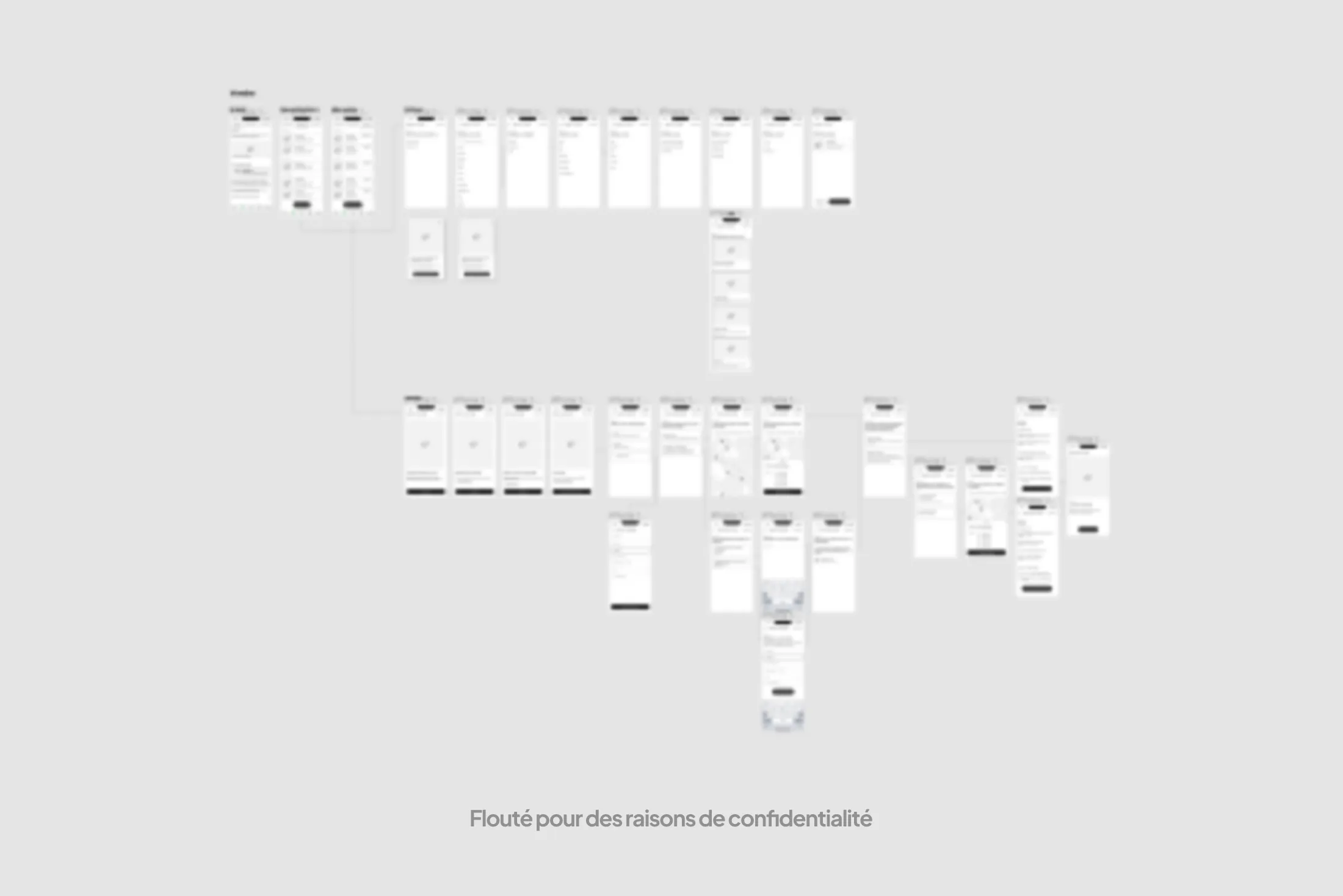
The wireframes delivered at the end of the sprint covered all key user flows, with particular attention paid to information hierarchy and step reduction on critical paths. The interface was designed to stay true to Smala's visual identity while embracing the interaction conventions of native mobile apps, particularly around tab-based navigation and notification management.
The mission concluded with the delivery of structured recommendations at two priority levels, alongside the full wireframe set for the mobile application. Development follow-up was not part of the scope of this engagement.
4. Results & Learnings
The project delivered a comprehensive audit of the existing experience, user insights from eight interviews, and a full set of wireframes covering the key flows of the mobile application. The recommendations provide a clear prioritization framework for improving conversion and repeat usage, with a clear distinction between quick wins and deeper structural changes, particularly around the listing journey.
This project was a good reminder that in e-commerce, the details compound. One extra step in the seller flow, a poorly worded rejection message, a pricing structure that feels opaque: each of these can seem trivial in isolation, but together they create friction with real consequences on available stock and, ultimately, on revenue. Working on a B2C product like this also sharpened my understanding of the engagement levers that native mobile capabilities unlock, tools that are easy to underestimate when most of your work lives in web interfaces.
What would I do differently? I would have pushed to run user testing sessions at the end of the second sprint, to validate the navigation choices and the redesigned seller flow before final delivery. Time constraints made it impossible, but that kind of validation would have made the recommendations considerably more robust.