
Introduction
Omnip is a startup connecting freelance beauty therapists with salons for last-minute replacements. In January 2025, Lonestone brought me in to conduct a UX and UI audit of their application ahead of its public release. Over two days, I analyzed the full experience, exchanged with both founders and the lead developer, and accessed the pre-production build via TestFlight, before delivering a structured set of recommendations organized by priority level. The goal: identify what could block or frustrate users, and propose concrete, actionable improvements before launch.
How might we evaluate the user experience of an application in development and deliver prioritized recommendations, in order to maximize adoption at the time of launch?
UX Audit (heuristic analysis, recommendations)
User Flow Design (journey improvement proposals)
Product Strategy (short / medium / long-term prioritization)
Problem Definition
The application targets two distinct audiences with asymmetric needs: freelance beauty therapists looking for last-minute replacement shifts, and salons that need to fill an absence quickly. This dual-profile structure is a fundamental design constraint: every screen, every flow, every piece of copy needs to be understood and used effectively by people with very different motivations and contexts.
The audit was based on a heuristic analysis of the pre-production application, using Nielsen's ten heuristics as the evaluation framework. I supplemented this analysis with several conversations with both founders, to understand the product vision, positioning choices, and decisions already made, as well as with the lead developer, to reconstruct the history of technical and product decisions that had shaped the interface. These exchanges gave the audit a layer of context that interface analysis alone would not have surfaced.
Fix friction before launch rather than after
The application had no critical blockers, but several accumulated friction points, particularly in the account creation flow and error message handling, that could have undermined the first impression and hurt activation rates.
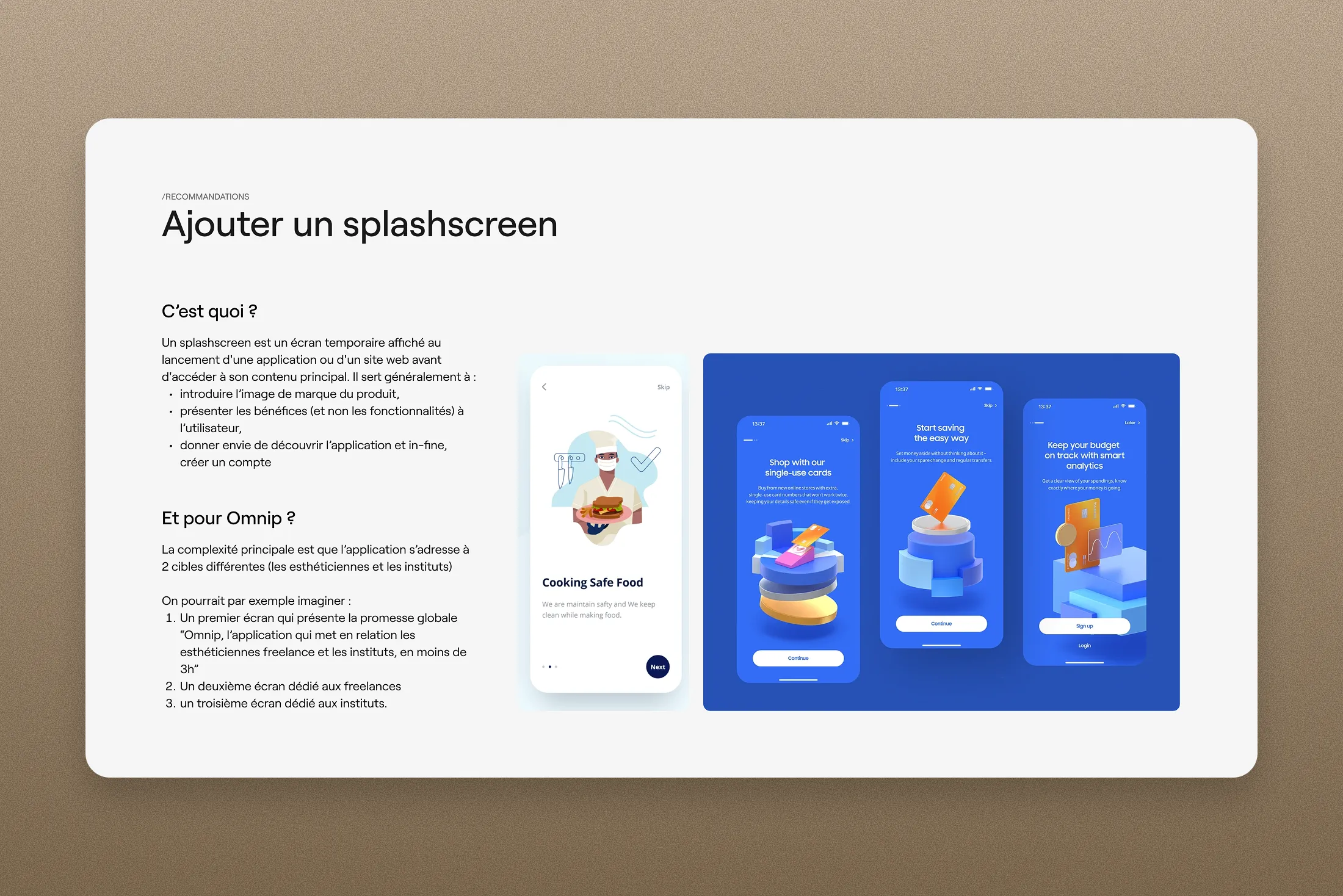
Clarify the value proposition within the first few seconds
With no splash screen or onboarding in place, new users arrived directly into the interface without any introduction or orientation. Adding these two elements represented a low-effort investment with meaningful potential impact on sign-up conversion.
Build a data culture from day one
Without analytics in place, post-launch product decisions would rely entirely on informal qualitative feedback. Setting up a data collection system from the moment the app went live was the prerequisite for adjusting features quickly based on real usage.
Solution Design
Recommendations were structured across three priority levels. In the short term, quick wins activatable before launch: fixing a handful of interface bugs, adjusting the wording of certain alert messages, clarifying the hierarchy of action buttons, and simplifying the home tab. In the medium term, initiatives to address in the first weeks after release: adding a splash screen to present the app's benefits to both target audiences, creating an onboarding flow to guide new users through their first experience, and improving contextual guidance through tooltips and explanatory elements. In the long term, putting in place a system for collecting both quantitative data (analytics) and qualitative insights (user interviews) to drive product decisions on solid foundations.
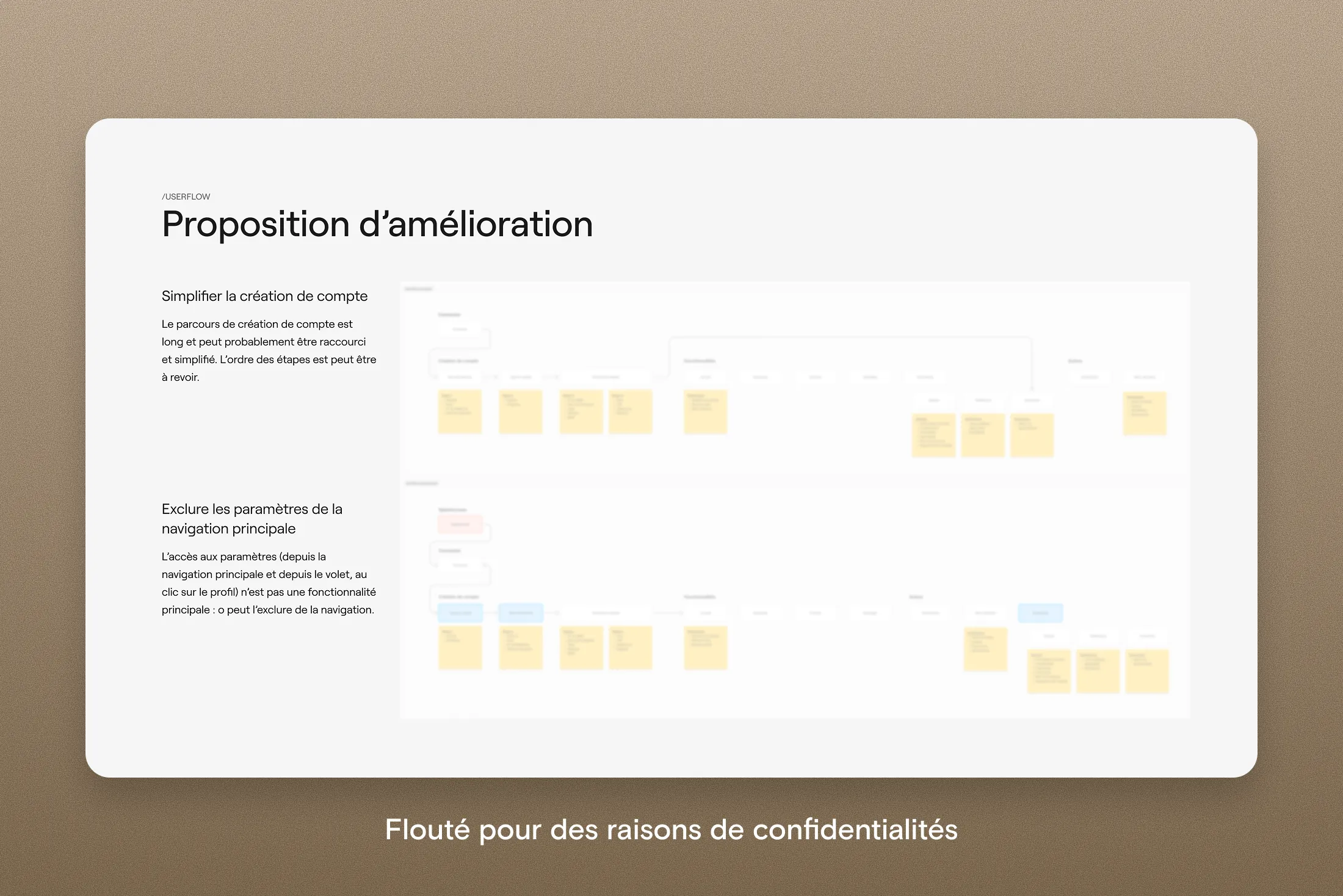
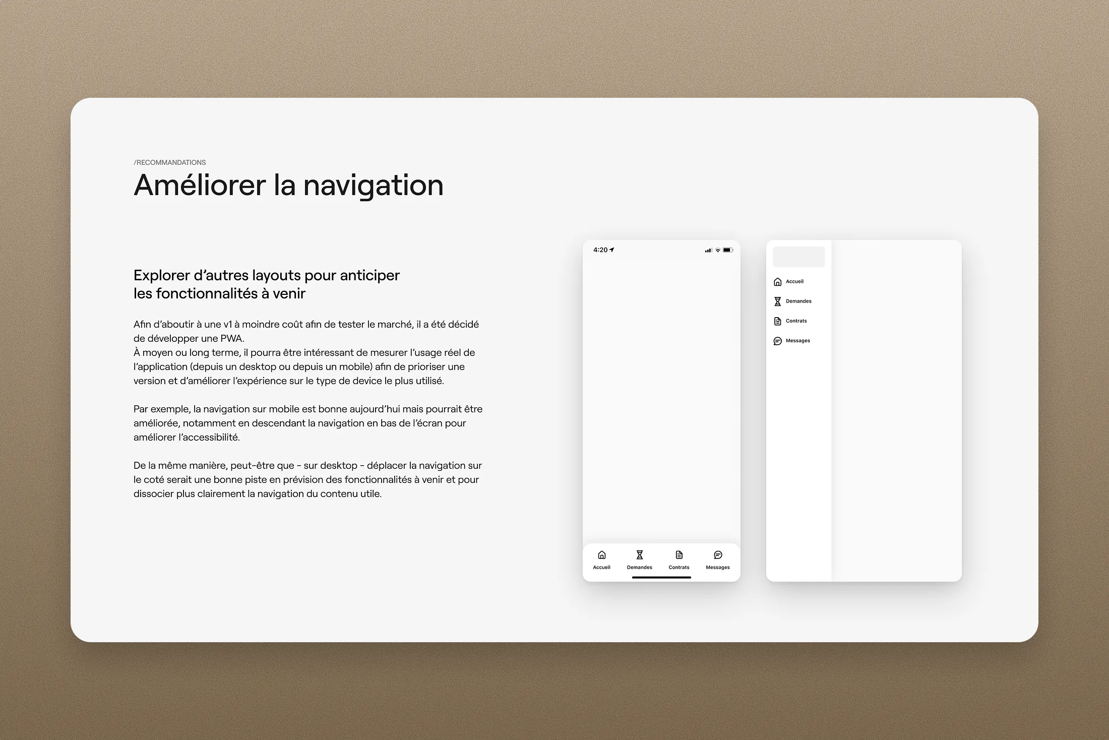
The audit covered all key flows within the application: sign-in, account creation, home, request and contract management, settings, and billing. Two structural themes emerged. The account creation flow, which required significant effort from users in the very first minutes, could be lightened by deferring the collection of non-essential information to a later stage. The main navigation, meanwhile, included settings as a top-level item despite it not being a core feature: removing it from primary navigation would have refocused user attention on the high-value actions.
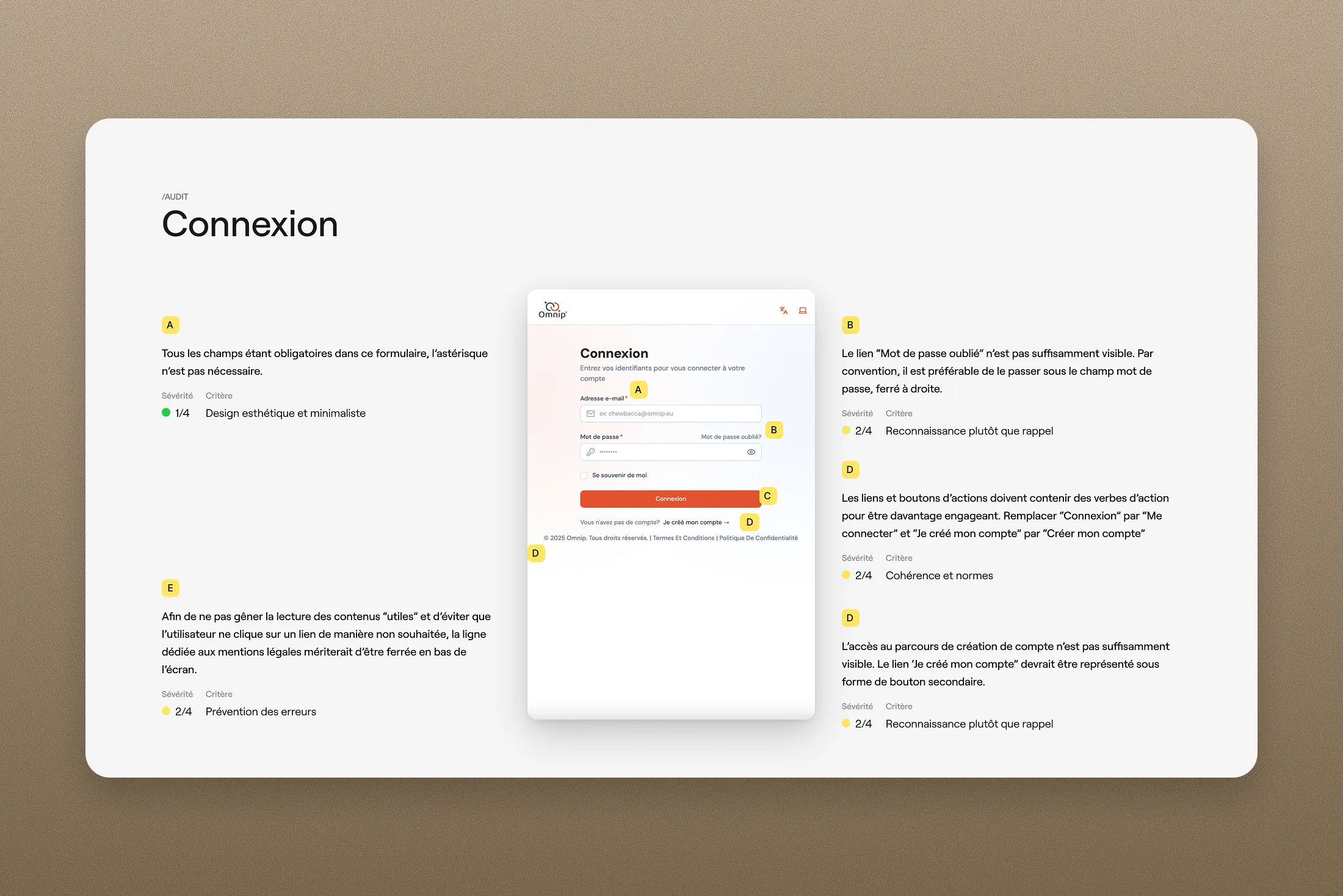
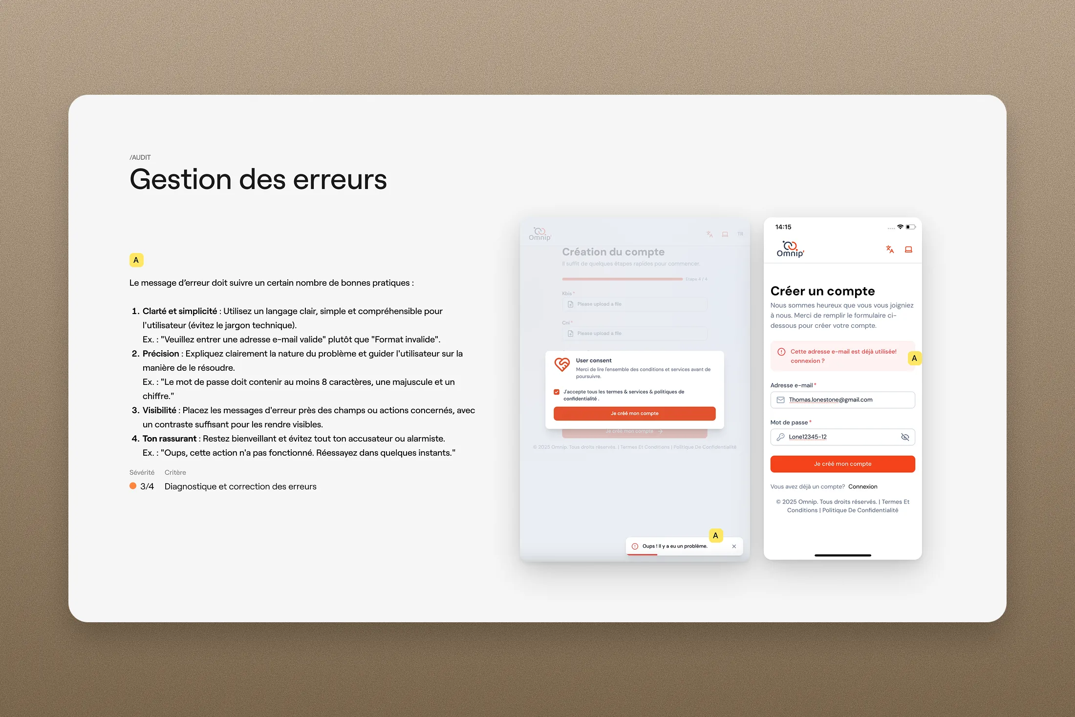
The audit flagged several interface improvements: redundant visual signals (asterisks and "optional" labels serving the same function), error messages that were insufficiently precise or poorly positioned, and action button hierarchies that could be sharpened on certain screens. These points, all rated low to moderate severity on the Nielsen scale, did not compromise overall usability but contributed to an experience that was less clear than it could have been.
Recommendations were delivered as a structured document combining a screen-by-screen annotated audit, improved userflow proposals, and a prioritized summary of next steps. The vast majority of short-term recommendations were implemented before launch, and the application has since been released in its updated version.
Results & Learnings
All short-term recommendations were integrated before the launch of the new version of the application. The work gave the Omnip team a more solid interface to go live with, and a clearer product roadmap for the months ahead.
This kind of short, tightly scoped mission forces you to get to the point: get up to speed fast, understand the business, prioritize without second-guessing. I find that constraint genuinely energizing. What I would have done differently: I would have pushed to speak directly with freelance beauty therapists and salon managers to round out the recommendations. The founders' input was invaluable for reconstructing the product context, but it remains a mediated view of real usage. Pressure-testing the product roadmap against direct market feedback would have strengthened some of the recommendations considerably.
On a more operational note, I would now systematically push to have analytics in place from launch for any product of this kind: running a product without usage data means navigating blind, and founders' convictions, however sharp, cannot substitute for what the numbers reveal about actual behavior.