
1. Introduction
France Vélo Tourisme is a non-profit association backed by the French government to promote cycle tourism across the country.
Its digital ecosystem spans 15 websites: a main hub (www.francevelotourisme.com) and 14 white-label sites dedicated to specific cycling routes (Loire à Vélo, Seine à Vélo, Véloscénie, and more).
In 2019, the sites were overhauled to help cyclists better plan and organise their trips.
By 2023, four years on, the association wanted to step back and take stock: were the sites actually meeting the needs of people planning a cycling holiday? Over five months, I led a solo discovery mission combining a UX audit, quantitative research and qualitative interviews, to answer that question and lay the groundwork for the next phase of design.
How might we assess the relevance of France Vélo Tourisme's current digital ecosystem and determine whether launching a mobile app represents a real opportunity, in order to give the association the strategic foundation it needs to shape its next phase of development?
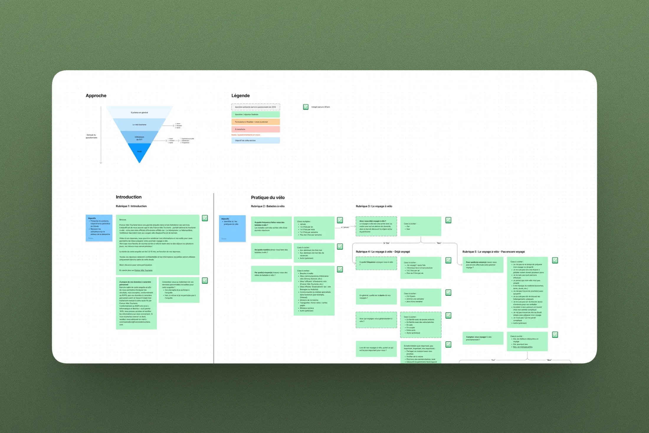
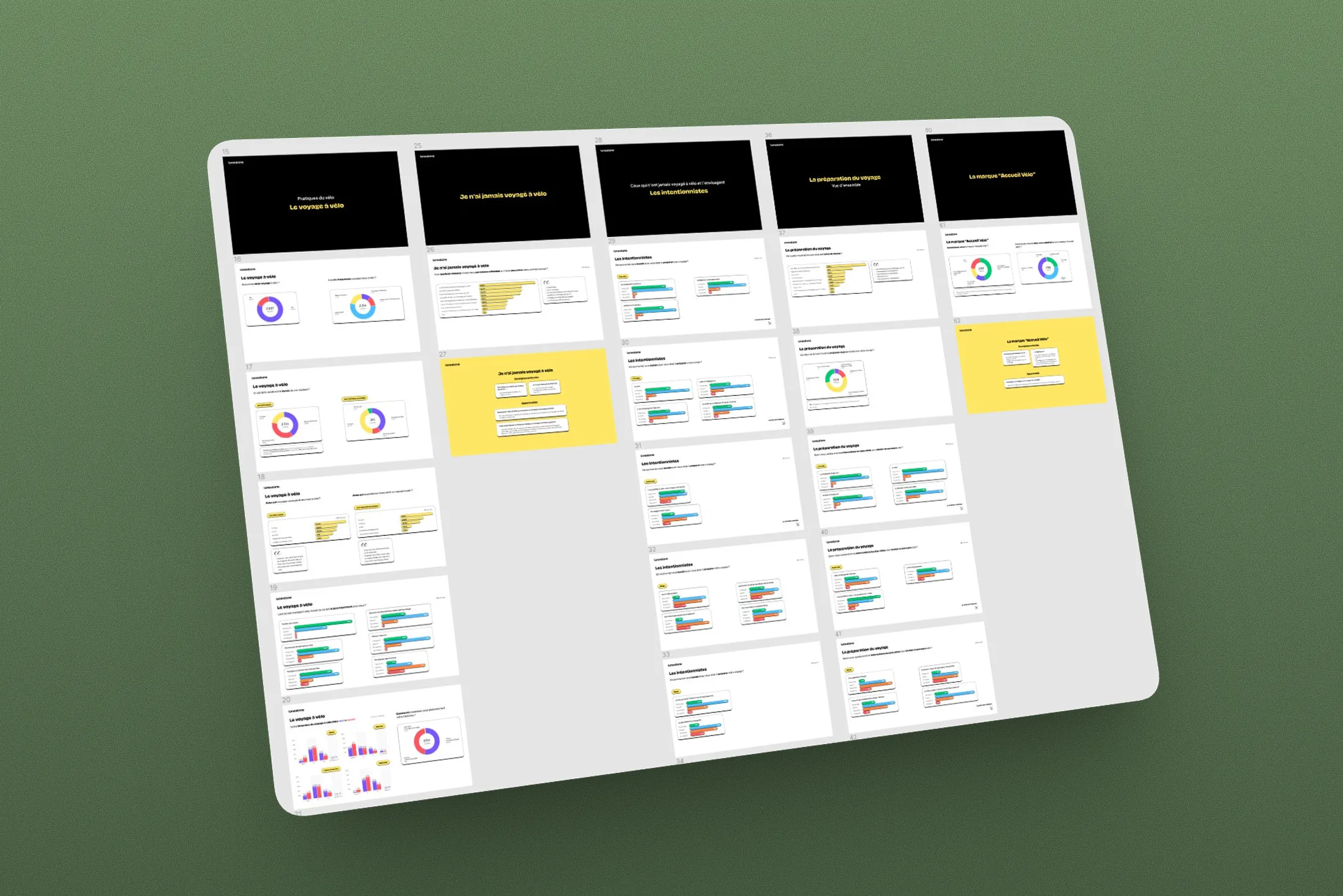
Quantitative research (funnel-structured multi-language survey, 3,400 responses) and qualitative research (9 interviews), to understand real cyclist needs while planning and during the trip.
UX/UI and technical audit of the current ecosystem + competitive review, to produce actionable, prioritised recommendations (impact / feasibility) to guide the next development phase.
Intent mockups and a prototype (including a mobile app concept) to make recommendations tangible; structured report with raw data and analysis layers, personas and presentation assets to align the team, partners and funders.
2. Problem definition
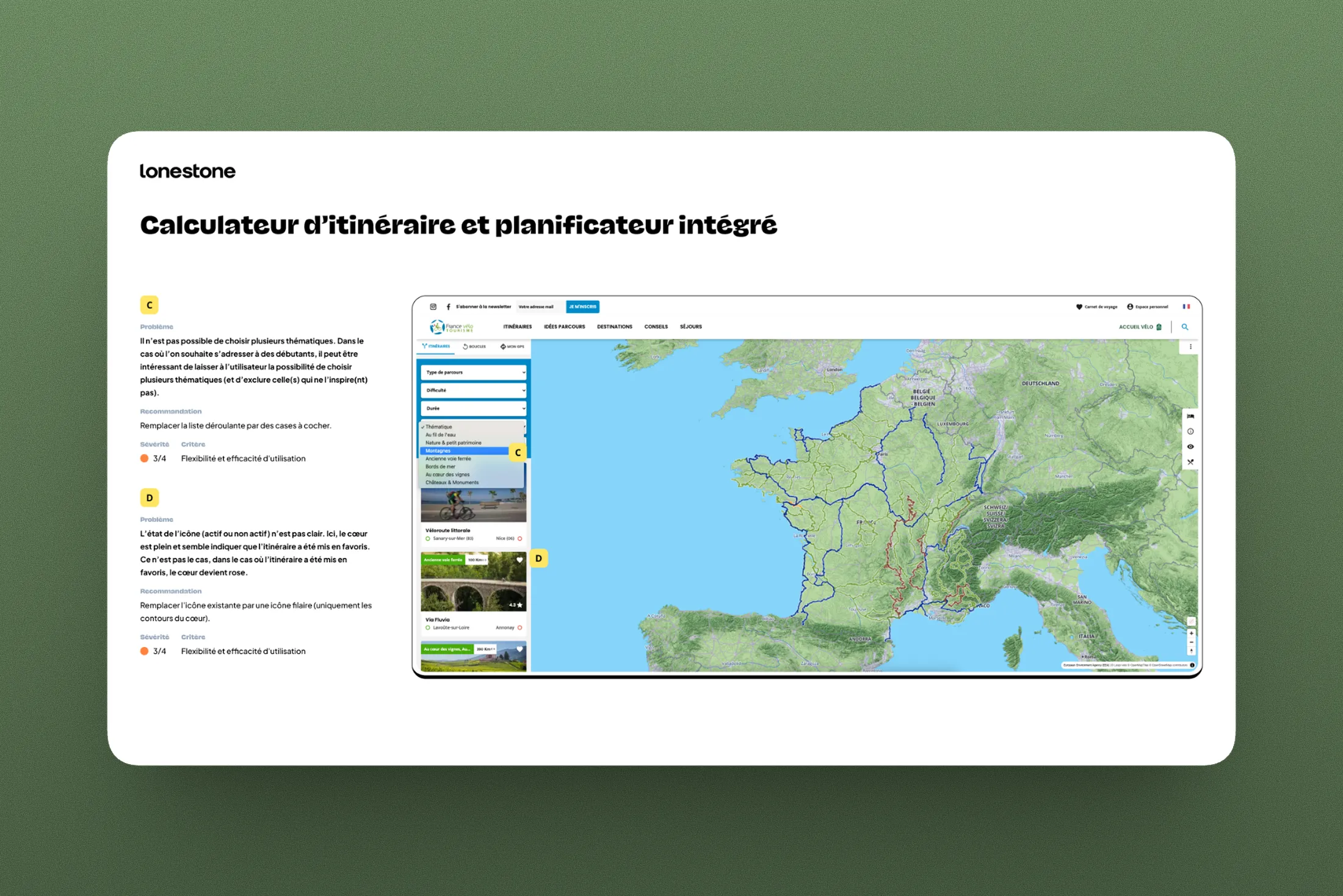
I started with a thorough audit of the existing site, looking at the user experience, functional scope and interface, but also at technical aspects that often go unexamined in this kind of exercise (load times, mobile behaviour) and that directly affect the quality of the experience. I then conducted a competitive review focused on the site's core features: searching for a route, planning a trip and leaving a review. To push the analysis further, I looked well beyond the cycling sector, exploring travel tools, outdoor apps and booking platforms, to identify different ways of addressing the same user needs and avoid the blind spots that come with staying too close to one industry. The phase concluded with a prioritised list of UX, UI and functional recommendations, ranked by impact and feasibility.
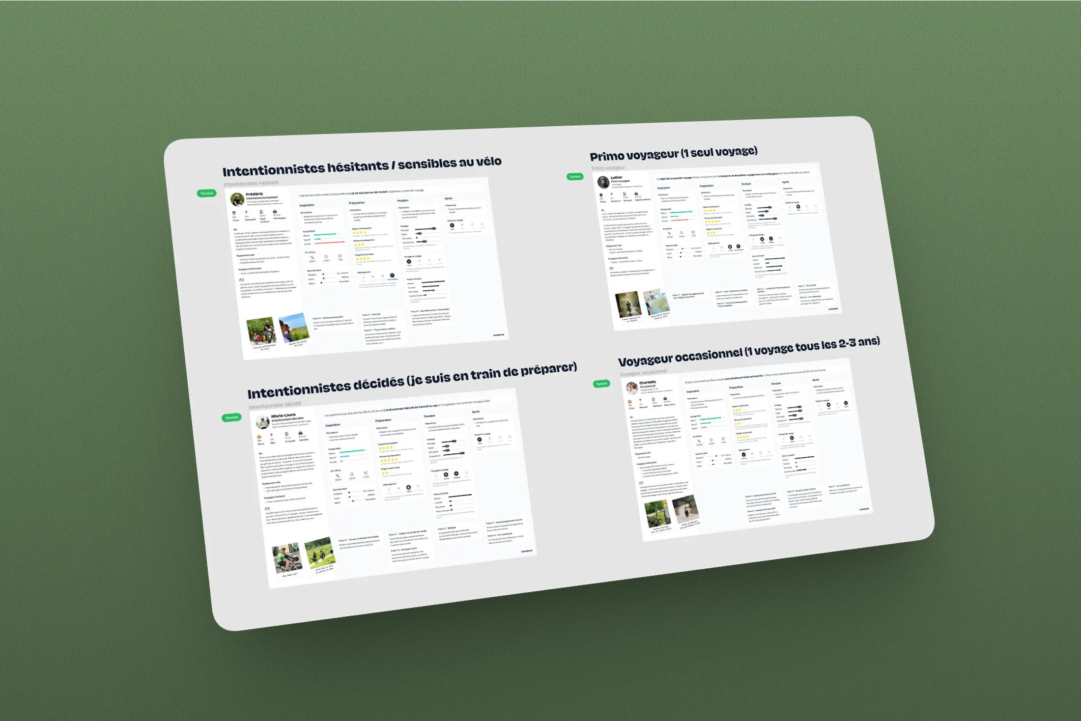
The user research unfolded in two complementary stages. First, a quantitative approach: I co-designed a funnel-structured survey with the FVT team, built to reach both occasional cyclists and regular France Vélo Tourisme users. Distributed over four to six weeks depending on the language (French, English, German and Dutch), it gathered nearly 3,400 responses, far exceeding the initial target of 1,000. I then followed up with 9 qualitative interviews, structured around a grid crossing three maturity levels (cycling-curious, intent-driven and experienced) with three traveller profiles (solo, couple/group and family with children), resulting in nine distinct interview frameworks to cover the full range of use cases.
DELIVERABLES
The UX deliverables for this mission were primarily analytical and strategic in nature. I produced a report structured across two layers: raw, factual data on one side and analysis slides on the other. This separation is deliberate: it allows stakeholders to challenge my interpretation without losing access to the underlying data. I also created personas drawn from the combined quantitative and qualitative findings, which turned out to be the most effective format for spreading the mission's insights beyond the immediate team, reaching the association's partners and funders. Intent mockups complemented the written recommendations by making the main directions concrete and visual.
Trip planning: an underserved moment
Users come to the FVT sites with a concrete planning need, but the digital ecosystem does not support them enough at this stage. Strengthening planning-oriented journeys is the highest-impact lever available.
Wildly different expectations depending on the profile
The needs of a seasoned solo cyclist have little in common with those of a family trying cycle touring for the first time. The quantitative and qualitative research surfaced distinct user journeys that deserve to be addressed differently.
Mobile: the neglected half of the experience
In the field, cyclists rely on their smartphones. Yet the sites were not built for mobile use, and technical friction (load times, mobile behaviour) was degrading the experience at the most critical moments of a trip.
3. Solution design
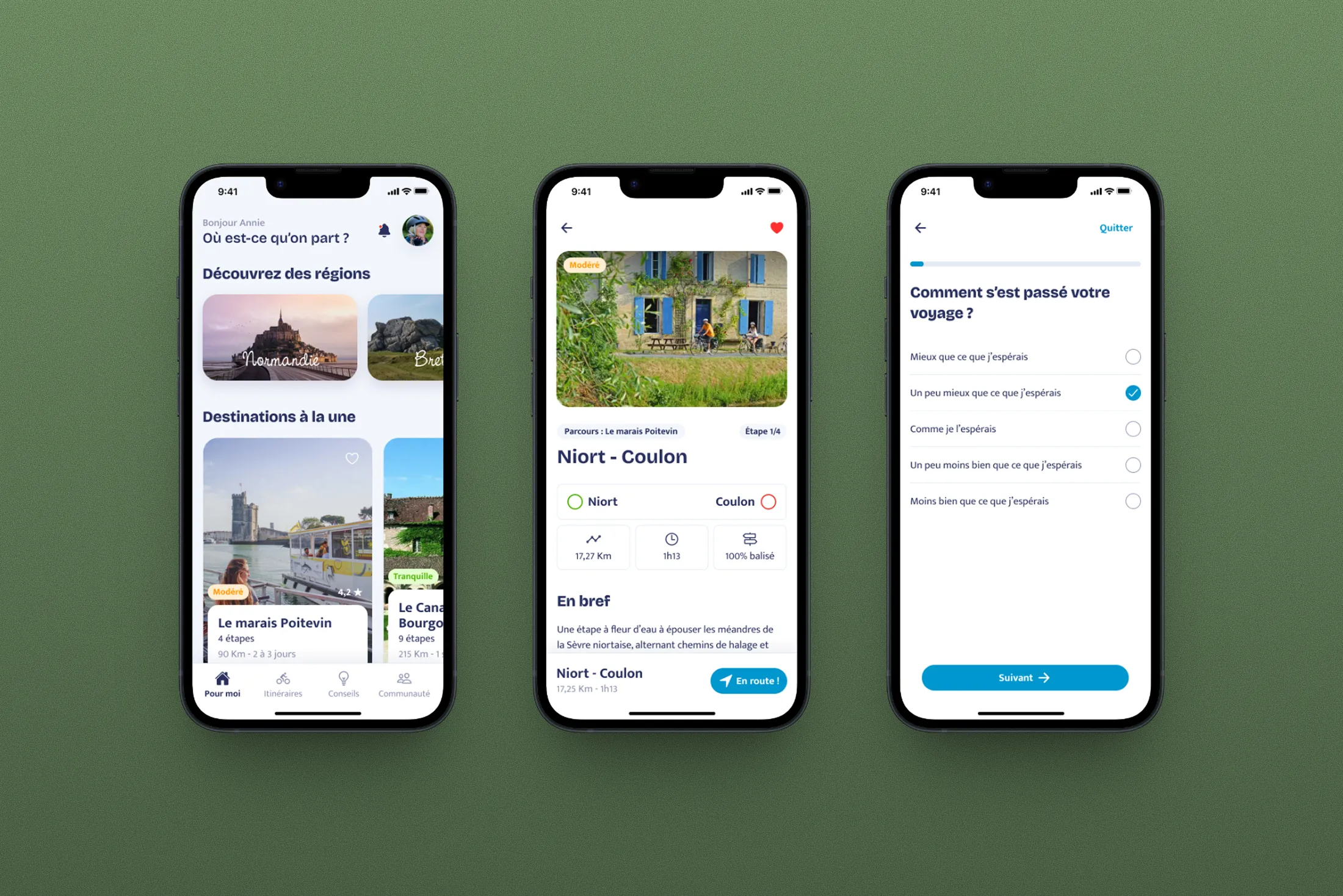
This was a pure discovery mission: the goal was not to deliver finished screens, but to produce reliable insights and actionable strategic recommendations. That said, to make the recommendations tangible and help the FVT team project themselves into what comes next, I produced intent mockups and a prototype illustrating the main directions. This included a mobile app concept, designed as a proof of concept for what a natively field-first experience could look like, built on the insights uncovered during the research. The visual approach was deliberately restrained, so as not to front-load decisions that belong to the future design phase.
4. Results & learnings
The mission produced a clear, well-documented picture of the France Vélo Tourisme digital ecosystem: its strengths, its blind spots and the priority areas to address. The team now has solid user insights, a refined audience segmentation and a prioritised set of recommendations to guide their digital roadmap. The personas deliverable, in particular, travelled far beyond the product team and became a communication tool used with the association's partners and funders. Less than a year after handoff, France Vélo Tourisme brought Lonestone back for the design phase.
This project confirmed something I had always believed but had not had the chance to test at this scale: triangulating sources of information (audit, quantitative research and qualitative interviews) does not simply multiply the volume of data, it strengthens the findings. When an insight surfaces in both a 3,400-response survey and a 45-minute interview, it becomes very hard to dispute. That level of robustness is what makes it possible to defend recommendations in front of a team, funders or external partners.
What would I do differently? Honestly, not much on the substance. The structure of the mission (separating raw data from analysis, choosing personas as the primary restitution format, building a cross-referenced interview grid) proved sound. If there is one thing I would optimise, it would be to think even earlier about how the client will circulate the deliverables internally once the mission is over.