
Thank you so much for your involvement and hard work. The feedback we received was unanimous: clients, candidates, partners… everyone was enthusiastic. Even the press covered it (BFM, Europe 2, RTL, etc.). The booth was so well-received that we already have new orders. It's a wonderful recognition of what we've accomplished together, and I'm convinced it opens up very promising prospects for the future.
Introduction
Long story short
Ciblijob is a job orientation and employment support solution, deployed inside immersive interactive booths designed and built by Studio Katra. The device is aimed at a wide range of users, including people with limited French, those unfamiliar with digital tools, or those facing stressful and fragile situations, and it has to work autonomously, without constant human support. Over the course of just over a month, I designed the entire user journey, from the moment a candidate approaches the booth to the moment they walk away with their CV in hand. The challenge was not simply to design an interface: it was to make design a tool for inclusion.
Objective
How might we design an autonomous, inclusive and multilingual journey inside an immersive booth, so that any candidate, regardless of their level of French or familiarity with technology, can generate a CV and access job opportunities in just a few minutes?
Roles
01 PRODUCT DESIGN (UX/UI)
UX/UI product design for the Ciblijob booth experience: interfaces, journeys and key moments of autonomous use.
02 USER JOURNEY DEFINITION
End-to-end user journey definition in a context of inclusion, multilingualism and low cognitive load.
03 HARDWARE / INTERFACE
Collaboration with Studio Katra to align interface, screen layout and physical booth constraints.
Problem Definition
Market research
Most existing employment support tools rely either on human accompaniment or on digital interfaces that assume a baseline level of autonomy. Ciblijob targets a blind spot: people facing several barriers at once, linguistic, digital and psychological. From the outset, I challenged the initial brief by pushing on two dimensions the client had not yet fully addressed: multilingual accessibility and maximum reduction of cognitive load. These two axes became the guiding principles of every design decision that followed.
User research
There was no formal user research phase on this project. Instead, I worked from the client brief, which I actively questioned to clarify its ambitions and constraints. In-depth conversations about the planned installation contexts (job centres, employment forums, public events), the expected user profiles and the real conditions of use provided a solid enough design and technical foundation to start conceiving with a clear picture of the use cases to address.
Once the design intentions were stabilised through a first user journey and a first prototype, we ran a technical MVP phase to validate our tooling choices: which LLM to use, which text-to-voice models to integrate, and crucially, which ones were robust enough to handle the full range of languages spoken by users. This phase allowed us to question and refine certain design aspects without undermining the foundations already in place, which had proven solid and sufficient.
Opportunities
01
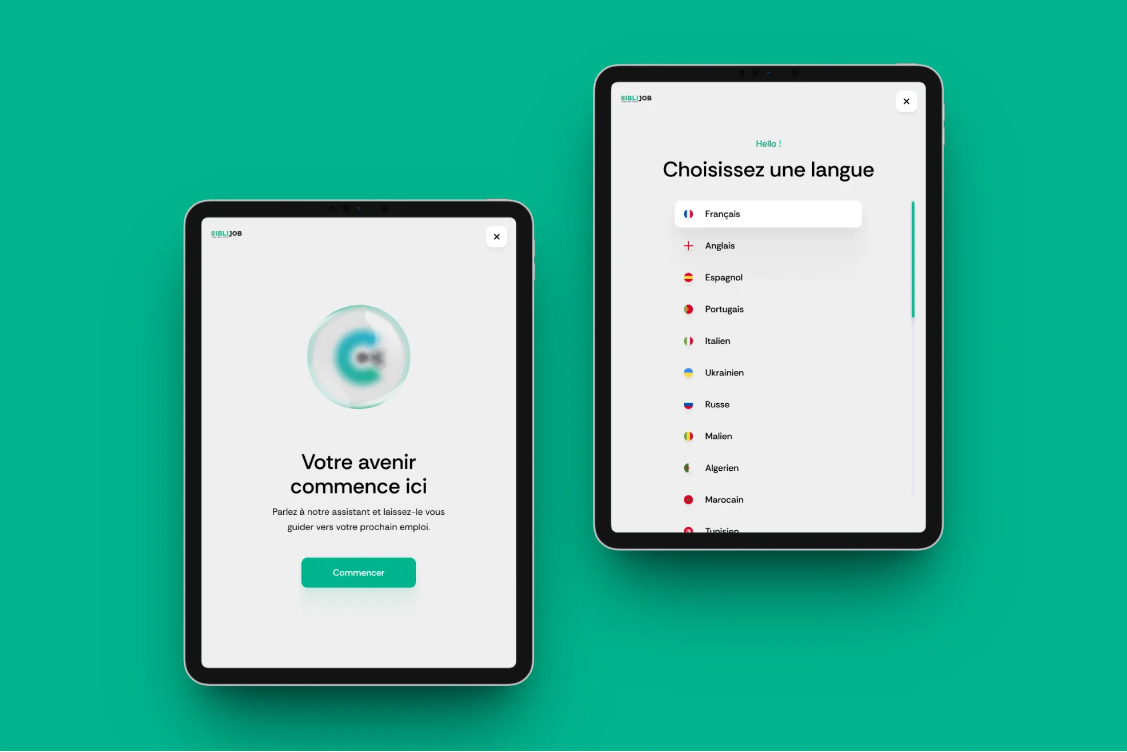
Language must not be a barrier
A significant share of users speaks little or no French. Designing for them means building highly visual interfaces, with minimal text, short and essential content, and a systematic anticipation of translation and comprehension challenges.
02
Autonomy as a condition of deployment
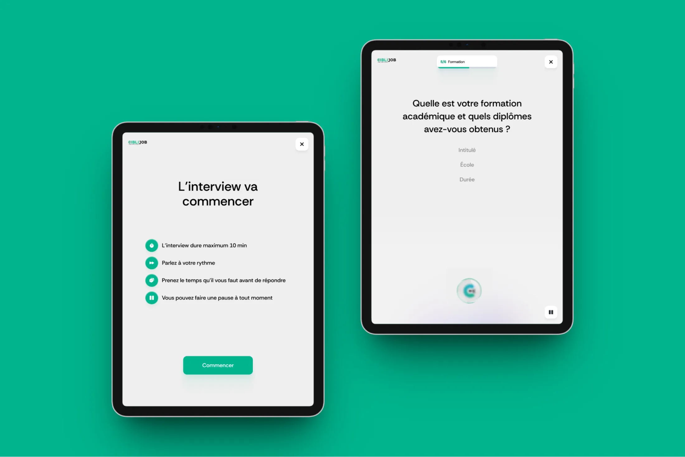
The booth must operate without a permanent attendant. Every step of the journey has to be immediately understandable, without outside help, which demands a level of interface clarity well beyond standard expectations.
03
Turning assessment into concrete opportunity
An orientation tool that only produces a diagnosis is not enough. The goal was to ensure that every user leaves with something tangible: a generated CV, identified job matches, and a clear next step to take as soon as they step out of the booth.
Solution Design
Scope & prioritisation
I covered the entire user journey, from the first interaction in front of the booth to the post-experience moment. This includes the welcome screen, information gathering, AI-powered CV generation, a simplified editing mode, job matching and the final restitution. Prioritisation was guided by a simple principle: anything that was not essential to the journey was removed. Simplicity and reduction of cognitive load took precedence over comprehensiveness.
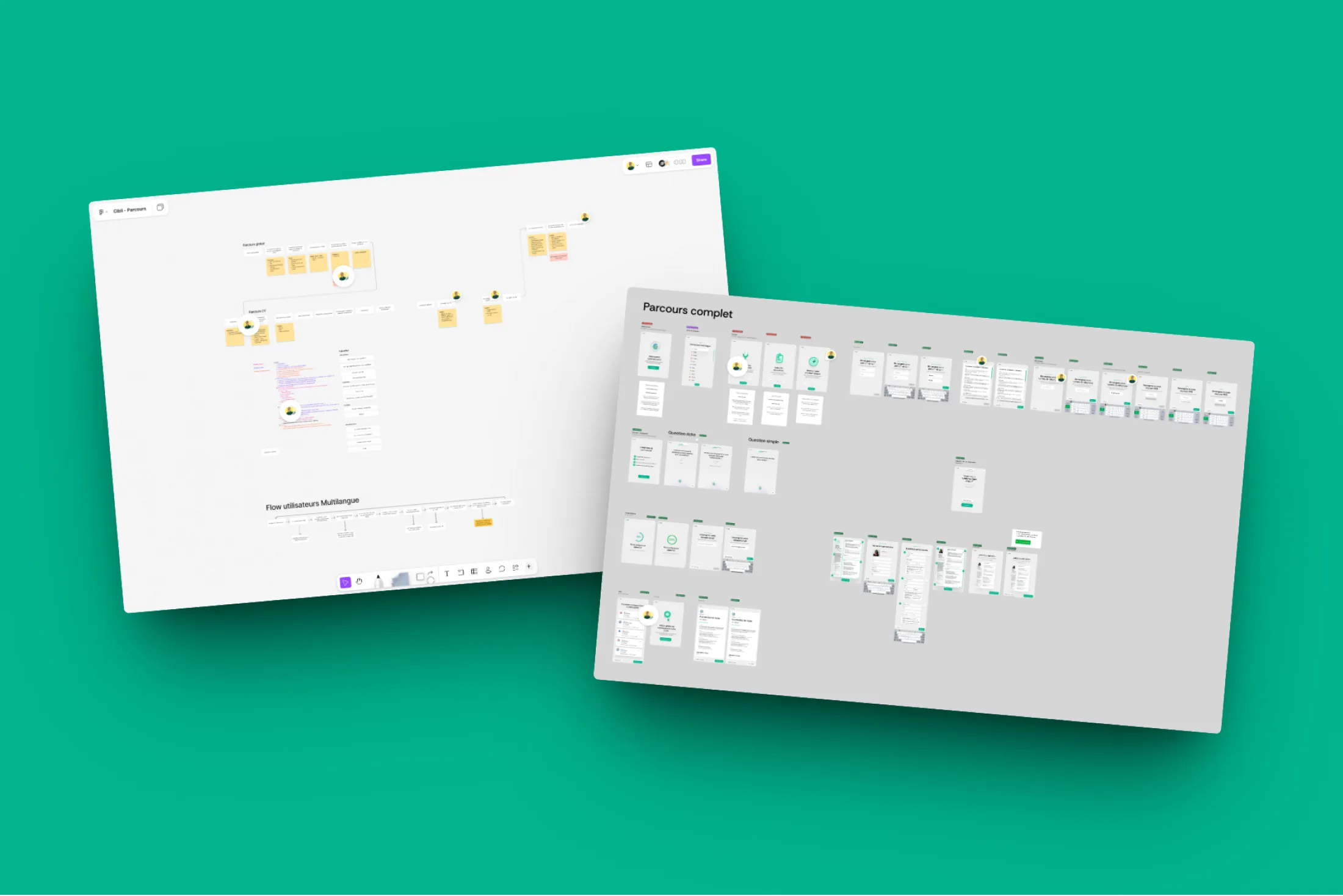
UX — Flows, wireframes
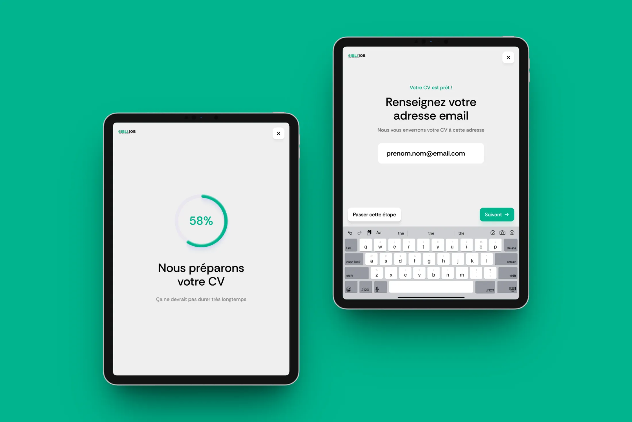
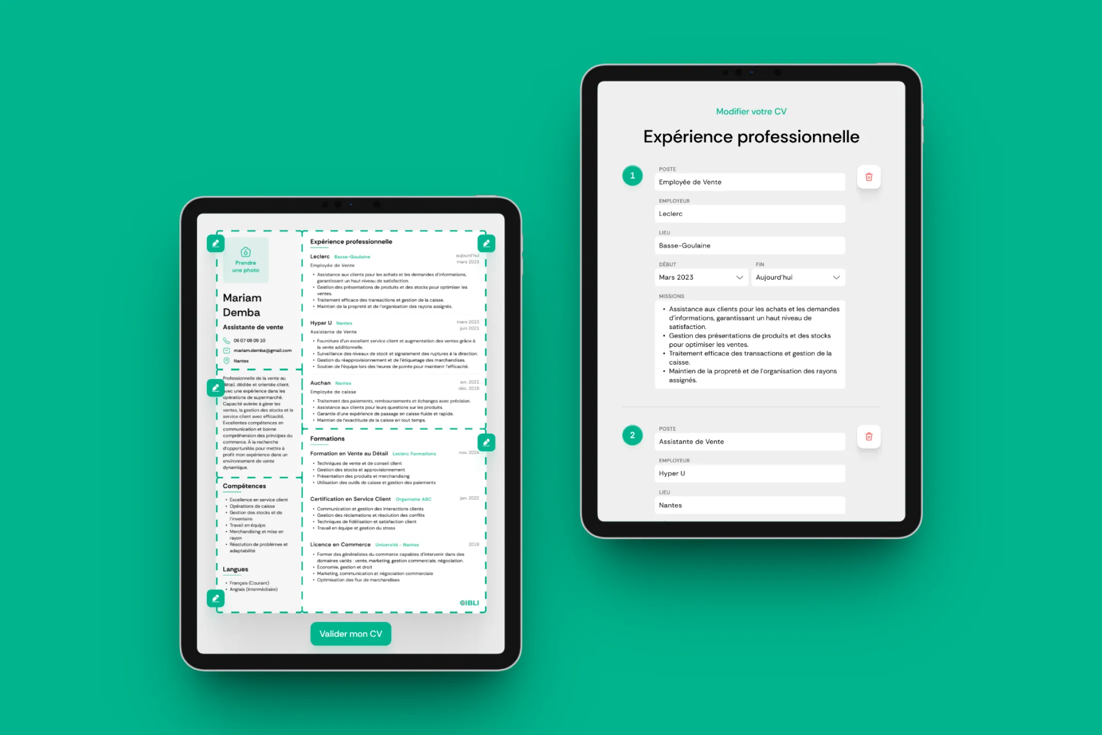
The journey was designed to be linear and reassuring, with no dead ends and no anxiety-inducing decisions. Each screen introduces a single action at a time. Interfaces are highly visual, with minimal displayed text, clear pictograms and interaction zones designed to be immediately identifiable. I also designed a simplified editing mode for the AI-generated CV review step: users can correct errors, adjust sensitive information (names, locations, companies) and fill in missing details, without ever being exposed to a complex interface. The goal of this mode was to give users a sense of control while maintaining the overall flow of the experience.
The on-screen content must help users understand what is expected of them without interfering with the audio instructions.
Visual Design & UI
The interface was deliberately minimalist, with generous white space and interaction zones placed at the four corners of the screen. This was not purely an aesthetic choice: it anticipated the hardware constraints that had not yet been defined at the time of conception, particularly the type and size of screen to be used. That anticipation proved well-founded. The design was initially conceived for an iPad form factor, and the screen ultimately selected by Studio Katra was larger, taller in particular. The design adapted without friction, confirming that the initial choices were robust enough to absorb that shift.
The generated CV can be edited at the end of the journey, allowing users to correct potential errors or add missing information.
Implementation, QA & development handoff
The collaboration with Studio Katra unfolded in two stages. In the first, I designed freely, without imposed technical constraints, while embedding screen size and type recommendations into my deliverables. In the second, we validated together that the design worked on the chosen hardware. Valentin, my Product Manager colleague, handled project coordination and facilitated the handoff with the development teams, which allowed me to stay focused on design quality throughout the mission.
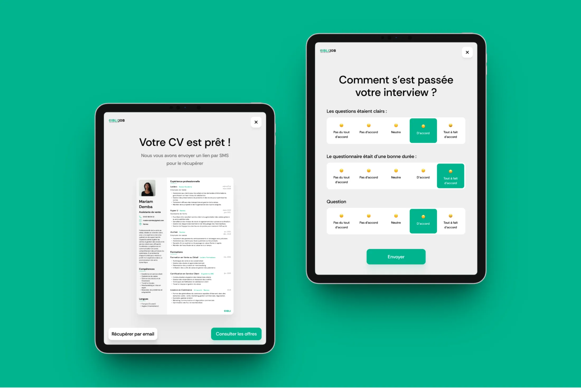
Collecting feedback is critical to help Ciblijob adjust the interview flow and improve the experience throughout the product's lifecycle.
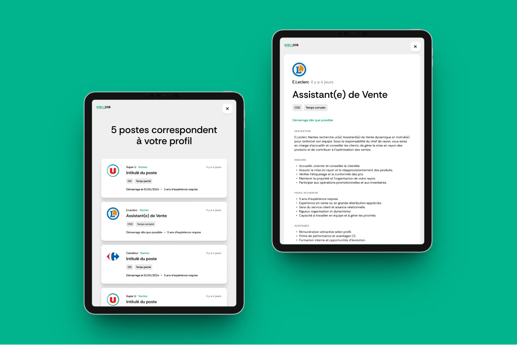
Once the CV is generated, the experience can continue with a selection of open positions that match the user's profile.
Results & Learnings
Results
The launch of the first booth was an immediate success. The inauguration event drew coverage from national media (BFM, Europe 2, RTL) and generated unanimously positive feedback from the clients, candidates and partners in attendance. Beyond the launch itself, the booth played a decisive role in Ciblijob's trajectory: it gave Samia, the project lead, significant credibility with institutional funders and partners, opening the door to new deployments across additional departments.
Impact
Validate the market
Candidates and partners adopted the booth with no friction.
Credibility
Stronger credibility in the eyes of funders and partners.
10+
Booths deployed across France in one year.
Learnings
This project reminded me that challenging a brief is not about questioning the client, it is about doing the designer's job. By asking early questions about ambitions, installation contexts and user profiles, I was able to identify two axes (multilingualism and simplicity) that shaped every design decision that followed. Without that upfront clarification effort, I might have delivered something functional but not equal to the inclusion challenges at the heart of the project.
What would I do differently? I would have liked to organise at least one informal observation session in the field, to watch real users interact with the booth. That kind of direct feedback is irreplaceable, even when the brief is solid.
Client feedback