
Thanks to this work, we are drastically reducing our technical debt and gaining in client-facing consistency. It also opens up great prospects for future features, where we will gain in speed and comfort across both prototyping and development.
Introduction
Long story short
Onafis is a French winetech scale-up developing a real-time SaaS platform for monitoring fermentation, aging, and production processes, built for winemakers, brewers, and distillers.
In a context of rapid growth, the platform had been built incrementally, without a shared design foundation. Onafis brought in Lonestone to establish a robust design system, unifying the experience, accelerating design-to-dev cycles, and preparing the platform to scale.
Objective
How might we build a consistent, well-documented design system to reduce technical debt, streamline collaboration between design and development, and deliver an experience that meets the standards of a professional SaaS tool?
Roles
01 UX/UI DESIGN
UX/UI Design across user journeys and interfaces, with a strong focus on operational clarity and readability.
02 DESIGN SYSTEM
Structuring design foundations, creating modular components, and formalizing a coherent, scalable visual language.
03 DESIGN OPS
Defining usage rules, delivering documentation, and collaborating with developers to ensure adoption.
Problem
Market research
The SaaS market for agri-food production professionals is rapidly maturing. The players that stand out are those who combine information density with interface clarity, a balance rarely achieved without a solid design system. Perceived product reliability is as competitive a differentiator as the feature set itself.
User research
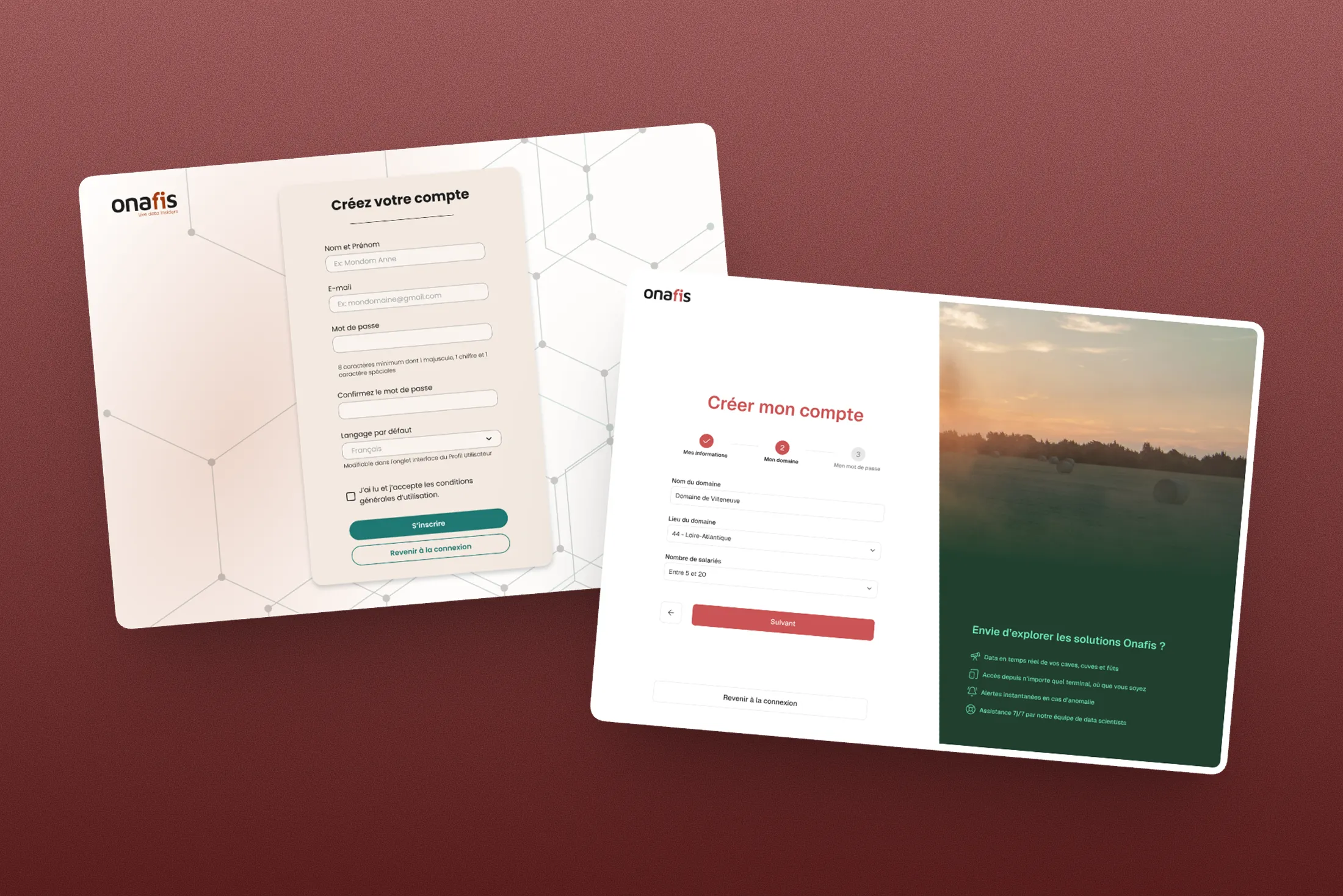
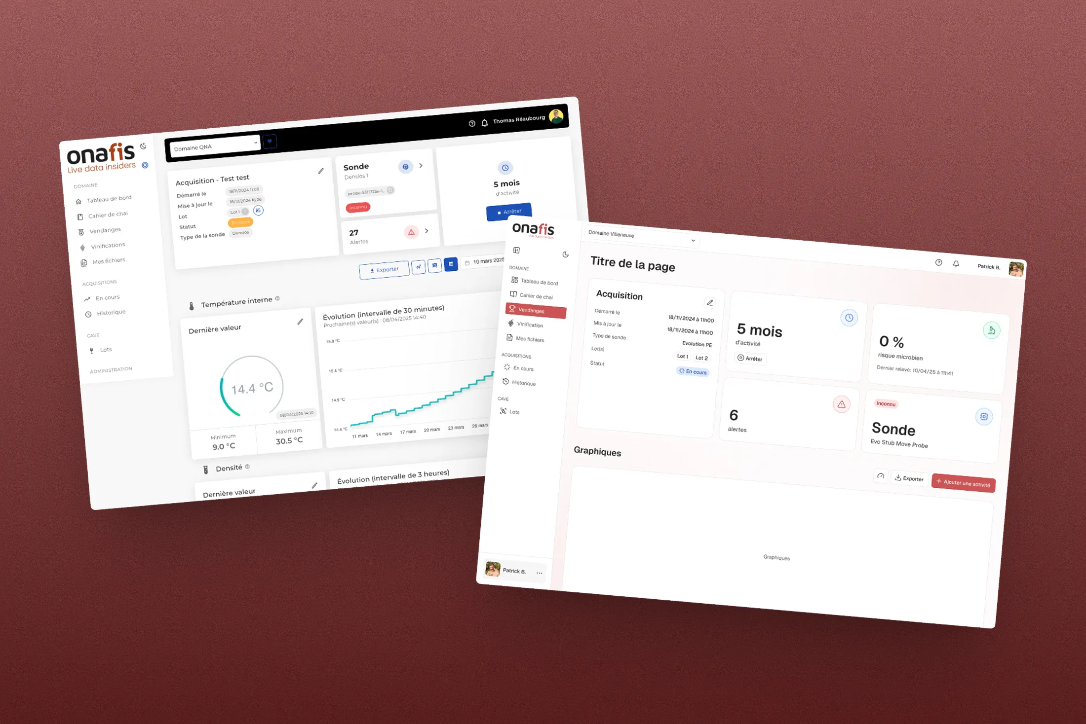
Onafis users, winemakers, brewers, oenologists, and estate managers, are demanding professionals who rely on precise operational data. They often use the platform in constrained environments, making navigational clarity and visual consistency non-negotiable. The absence of a shared design foundation translated directly into a fragmented experience and an erosion of trust in the product.
Opportunities
01
Unify to build credibility
Visual inconsistencies across screens are not just aesthetic issues: they signal product immaturity to professional users. A coherent design system is a trust-building asset.
02
Unlock velocity
Without reusable components or shared tokens, every new feature means reinventing already-solved patterns.
03
Build for growth
Designing the system with scalability in mind allows new modules and internationalization to be absorbed without starting from scratch.
Solution
Scope & prioritization
The project started with a scoping phase to define what was realistically deliverable within a fixed timeframe: a component inventory, design foundations (tokens), a modular component library, and hands-on support through the dev integration phase. Future evolutions (full dark mode, internationalization, mobile extensions) were anticipated in the architecture, without being built in this first phase.
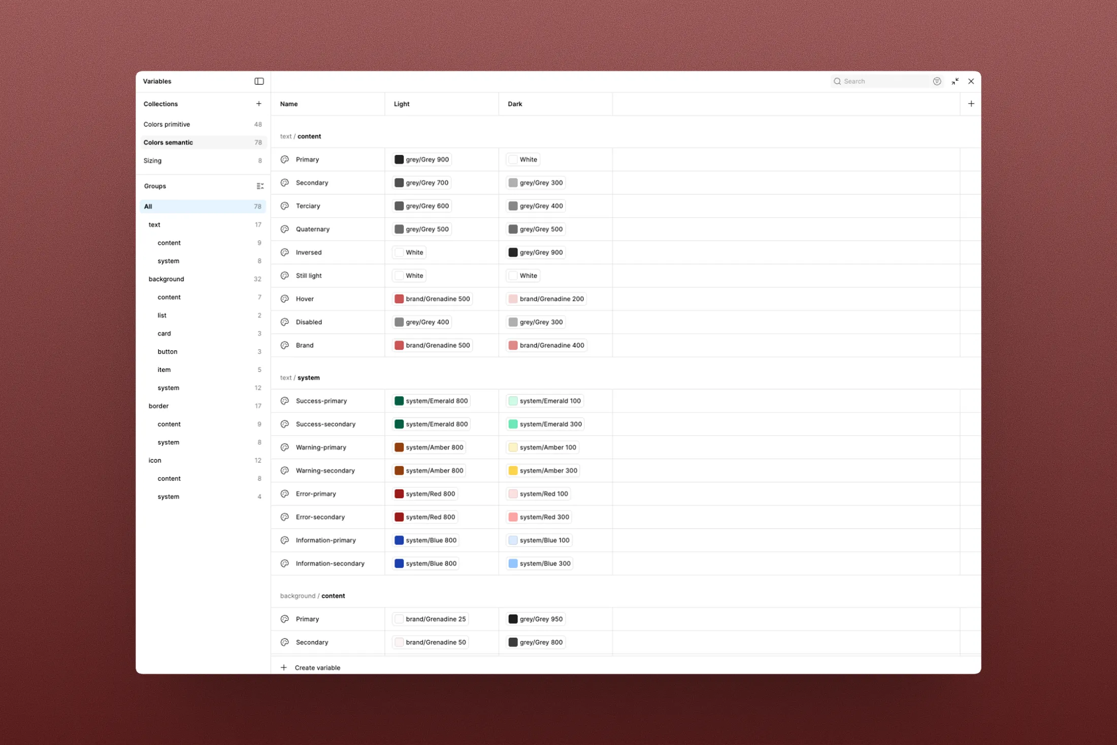
Audit & inventory
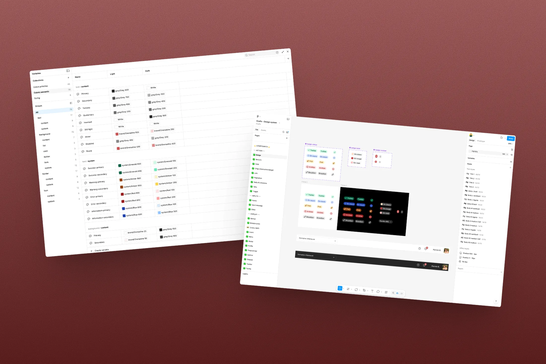
I started with a thorough audit of the platform: a full inventory of screens, identification of recurring patterns, duplicates, and inconsistencies. This inventory formed the backbone of the design system architecture.
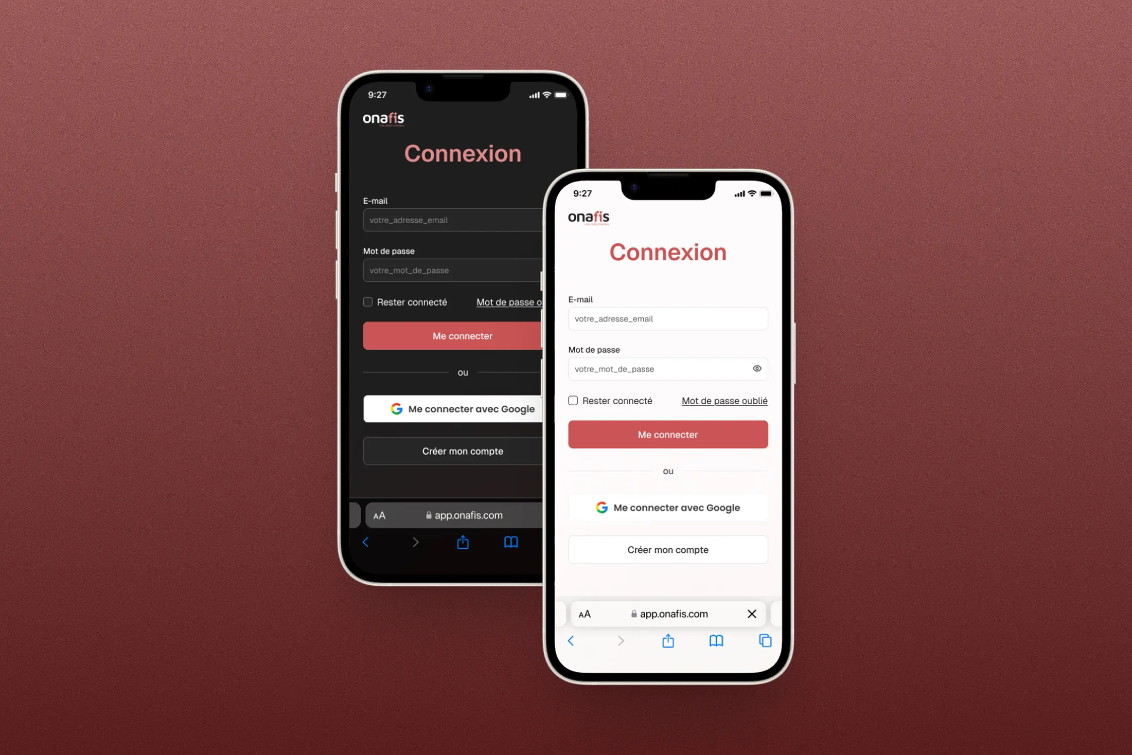
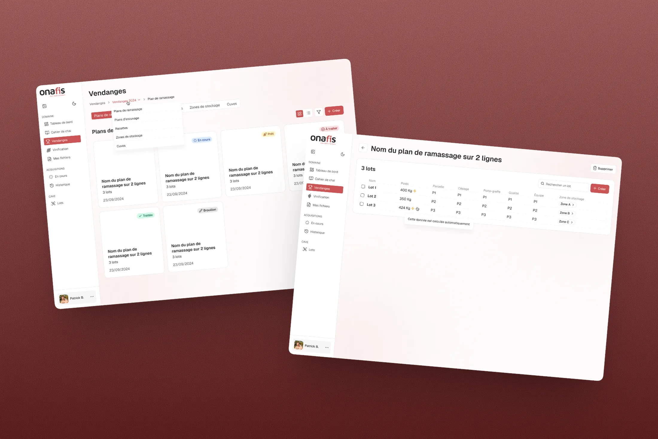
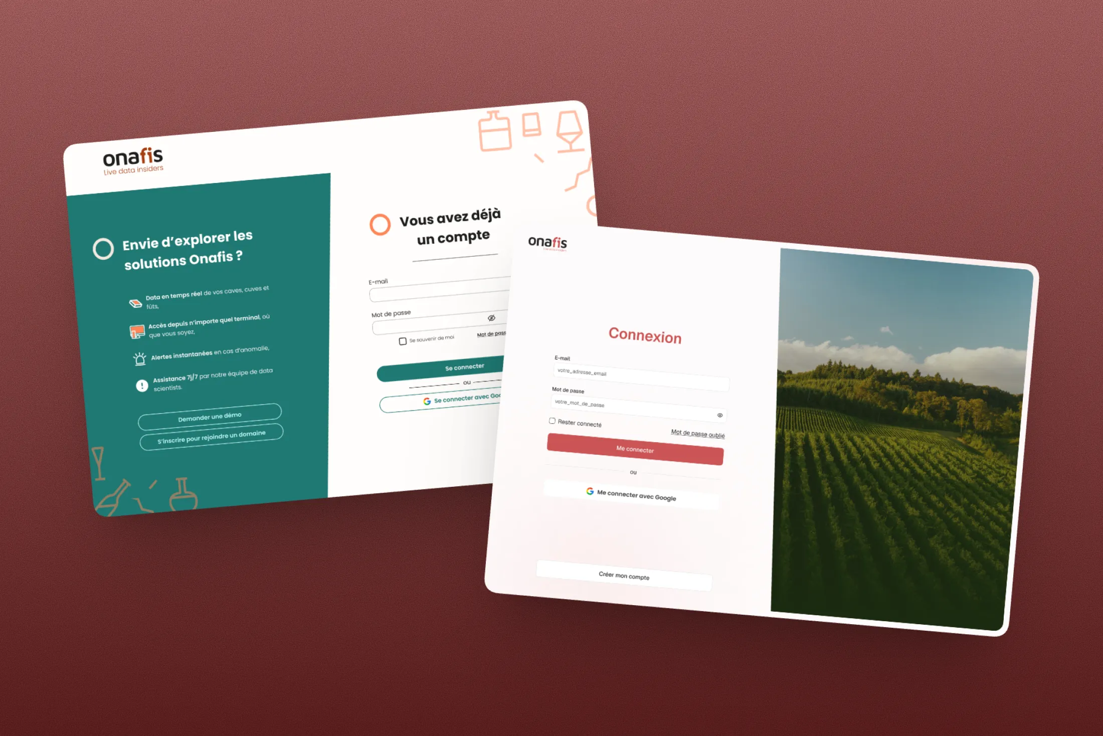
The components cover the core use cases of the tool: forms, data tables, lists, interaction states, and system feedback. Each component was specified with variants, usage rules, and edge-case behaviors.
Defining foundations
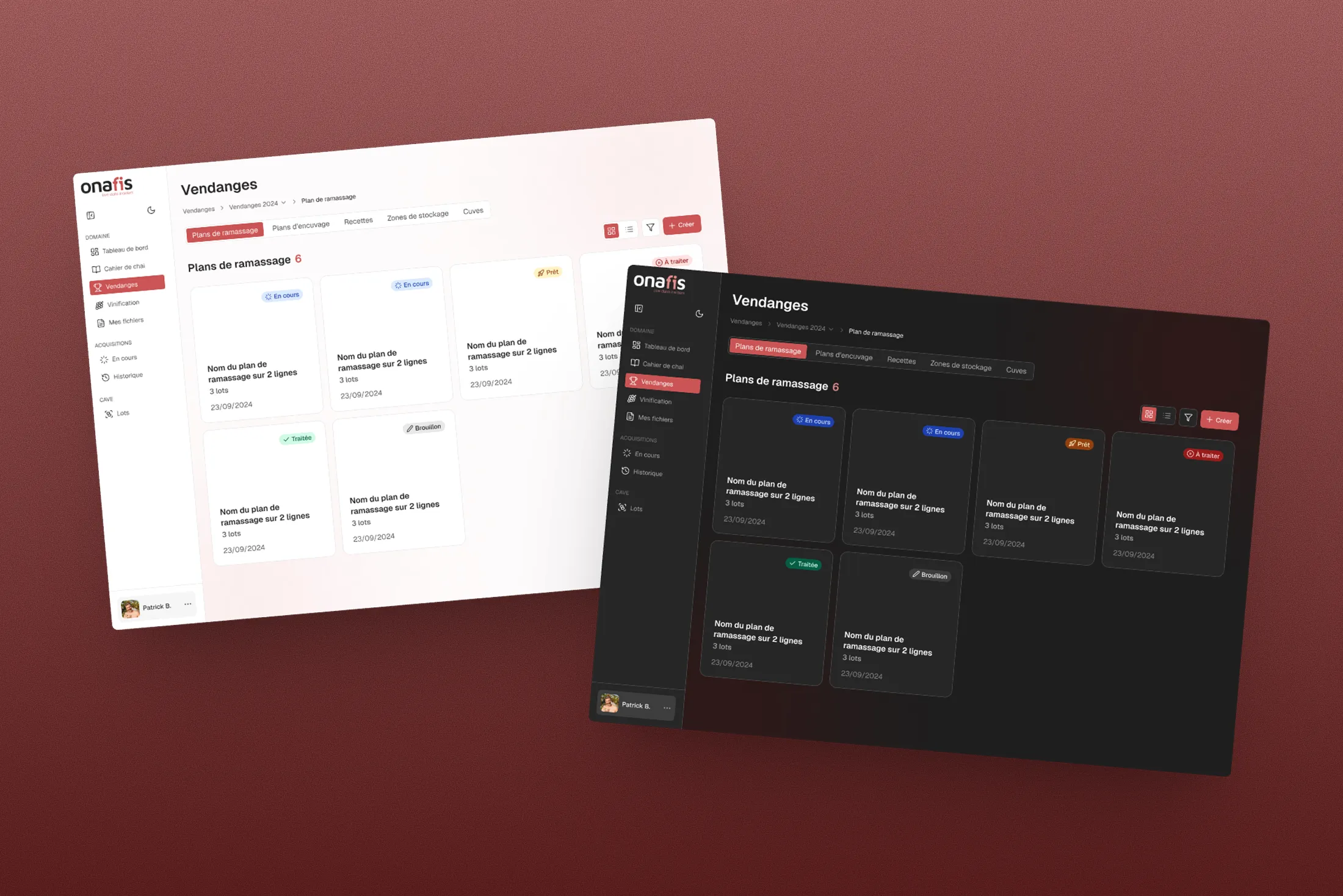
Typography, color, and spacing foundations were formalized as Figma tokens, with an architecture designed to support dark mode via Figma variables. The goal was to build something maintainable and evolvable, not just polished at delivery.
Implementation & dev handoff
After delivering the first version of the design system, we spent 15 days alongside the development team to support adoption, test in real conditions, and iterate on edge cases.
This co-construction phase turned specs into a living reference owned by the dev team.
Results
Results
The new version of the application shipped with the new theme, integrated design system, and migration to Quasar components (replacing VueSax). The Onafis team reported a significant reduction in technical debt and noticeably stronger UI consistency.
Impact
UI debt reduced
Through component standardization and migration away from VueSax.
Faster delivery
Now supported by a shared reference system.
Scalable base
For future evolutions: new modules, dark mode, and internationalization.
Learnings
After delivering the first version of the design system, we spent 15 days working alongside the development team to support adoption, test in real conditions, and iterate where needed.
I delivered a fully documented library with guidelines, best practices, and usage examples to ease adoption for designers and developers.
A design system that is not adopted is just good-looking documentation. The real value lies in its ability to be used, maintained, and evolved by a team.
Client feedback
They put in place a robust and effective design system, backed by a highly experienced design team. The development team, fast and adaptable, integrated the design system seamlessly. Their willingness to share knowledge was a real plus.